
A treemap answers the part-to-whole question a pie does how does a total divide, and what dominates? but it packs the shares into tiled rectangles instead of slices, so it holds far more categories before it runs out of room. Most breakdown reviews then arrive at a question a flat division cannot answer: how does that whole nest into categories and sub-categories at once? Which channel leads is rarely where the conversation ends; how the leading channel is itself composed is where it goes next.
Power BI ships the treemap natively. The Intelligence Sheet gathers it into a wider Hierarchy family treemap, sunburst, packed bubble, and decomposition tree-each reading the same category-and-measure setup, each drawing the nesting a different way.
Both read from Power BI semantic models. The difference is context whether the breakdown is read from a frozen model or reshapes when the plan behind it is revised. The running example is a hierarchical cut of the same sales data Actual Sales by Channel, a $12.4bn total split across Store, Online, Reseller, and Catalog, then broken down further by calendar year and quarter, and by brand, category, and subcategory.
Watch It in Action
Power BI Treemap
Power BI ships the treemap as a core visual: a category in Group, a measure in Values, and each rectangle sizes to its share of the total, reading its numbers straight from your Power BI semantic model. Add a field to Details and the tiles nest to a second level; a Legend colors them by category.
Treemap
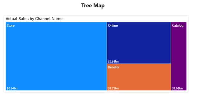
The Treemap lays the whole out as tiled rectangles, largest in the top-left and shrinking towards the bottom-right, here Actual Sales by Channel. It reads the same part-to-whole story as a pie, but because rectangles pack more efficiently than slices, it stays legible with a dozen or more categories where a pie would blur. Data labels carry the category and value; the visual cross-filters and drills like any native visual, and a Details field nests a second level inside each tile. Its limit is the one every treemap carries: once tiles get small, their labels drop out, and area is harder to judge precisely than length a bar (Episode 04) is the better reach when exact ranking matters.
A note on native treemaps
For a single-level or lightly nested breakdown, the native treemap is solid in a credibility case, not a gap. The edges show elsewhere: Power BI has no native sunburst or packed bubble, so both need a marketplace custom visual, with the governance review that carries. The treemap itself takes no IBCS formatting, so actuals, budget, and forecast can’t be styled to convention, and there is no running total in view. Power BI does ship a native decomposition tree, though it truncates every level to its top 10 members and caps the view at 5,000 data points across a maximum of 50 levels.
There are hard rendering caps worth knowing: the treemap renders a maximum of 3,500 tiles, the Group field is reduced to its top 500 categories, and a Details field to the top 20 labels per group all of it silently, with no warning to the reader that data has been dropped. Color saturation and Details cannot be used at the same time either, so a tile can be shaded by a second measure or nested at one level deeper, never both. And small multiples do not extend to the treemap, so there is no trellising one map per region or per period. None of that makes native wrong for a quick breakdown; it just marks where the Intelligence Sheet’s hierarchy family reaches further.
Treemap and Hierarchy Charts in the Intelligence Sheet
The Intelligence Sheet reads from the same Power BI semantic models your existing reports use and gathers these visuals into one Hierarchy group built on top of them treemap, sunburst, packed bubble, and decomposition tree each from the same category-and-measure foundation, switched by chart type. (A fifth member, the network graph, gets its own episode later in the series.) One control runs through all of them: from the advanced options you can split the same chart across a different category a channel view becomes a product or region view or group it by measure to set two measures side by side, without a rebuild.
Treemap
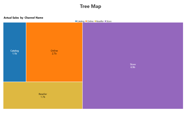
The Treemap carries the same tiling as native, each channel sized to its share of the total, but takes the IBCS themes the native tile cannot: solid actuals, outlined budget, hatched forecast, and green and red for variance, so a plan-versus-actual breakdown reads to convention rather than by raw color. A legend labels the categories, and the split-by-category control repoints the tiles from channel to product or region in place. It is the reach when the breakdown belongs in a formatted management pack, not just an exploratory page.
Sunburst
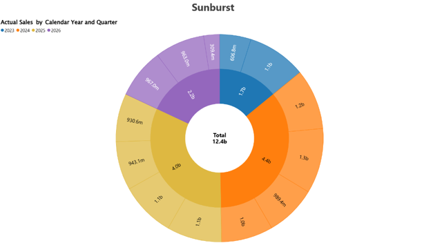
The Sunburst turns the hierarchy into concentric rings: the inner ring is the top level, each outer ring a level beneath it. Here Actual Sales by Calendar Year and Quarter the inner ring holds the years, colored by year, and the outer ring breaks each year into its quarters with the value printed on every arc, so the yearly totals and the quarterly detail beneath them read in one shape. A Total sits in the center well, and you can drill into a ring to focus for a single year and back out again. It is the reach when you want the nesting shown rather than tile by tile best kept to a hierarchy with only a few values per level; add a third ring such as month and the arcs thin out until the labels no longer fit.
Packed Bubble
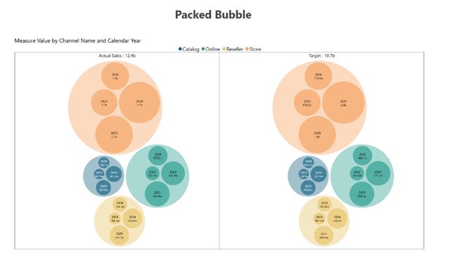
The Packed Bubble drops the rings and packs the breakdown into circles sized by the measure and colored by top-level category. In cluster mode (packed circles) each channel becomes an enclosing circle with its year bubbles nested inside, so the grouping is explicit rather than read from color alone. Grouping the measures from the advanced options splits it into one cluster set per measure, so Actual Sales and Target sit side by side and the same Channel-and-Year composition reads across both at once a channel’s circle larger under actuals than under target marks where performance ran ahead of plan. With no arcs to thin out, it stays cleaner than the sunburst when a level carries more values than a ring can hold, and the eye compares circle areas within and across the panels. It is the reach for a many-membered breakdown where you want magnitude, explicit grouping, and a measure-to-measure comparison in one compact shape.
Decomposition Tree
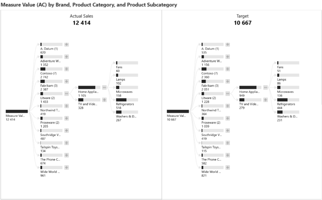
The Decomposition Tree reads left to right instead of by area: a root total that branches down the hierarchy at one level at a time, with an expand and collapse control on every node. Grouping the measures turns it into a planning view it panels the tree once per measure, so Actual Sales at 12.4b and Target at 10.7b stand side by side over the same brand-to-subcategory hierarchy, and any branch reads against its plan where it sits: Contoso at 2.7b against 2.4b. Because both panels carry the same members, all eleven brands appear in each, where the native tree stops at the top 10 of every level. The IBCS format renders it monochrome throughout, so it drops straight into a management pack, and because the plan panel is read from the model rather than copied into it, a revised target re-bases that panel in place. It is the reach when the audience wants to open the breakdown path themselves and find the plan already beside it.
The underlying configuration is the same across all four categories, a measure, and an optional second level with the chart type switch and the split-by-category control deciding how the nesting is drawn.
Built for the Planning Workflow
Because these charts sit on your Power BI semantic model, they break down the data you already reported today. They go further when that model is paired with a plan: a hierarchy chart in a planning review is usually asking a structural question is the mix across channels, and the split of each channel into products, the shape the business planned for? That makes the comparison a planned mix, a prior-year share of the breakdown rather than a separate chart.
In most reporting builds, that comparison is fixed. The planned mix of the target shares for each channel, the budgeted split across products is loaded into the model at the start of the period and sits frozen there while actuals move against it, accurate about the past and silent about every revision since. That tells most of the decomposition tree, where one of the two panels is the comparison. A stale’s plan does not merely shift a shade; it mislabels half the chart.
Read from a live plan instead, a budget reallocated between product lines this morning re-sizes every connected tile, re-draws every ring, and re-bases the plan panel beside the actual by the afternoon, with no export and no reconciliation step. The structure a reviewer reads are then the structure against the plan as it stands, so the review can close on where the mix needs to change rather than on reconciling whose number is current.
A flat breakdown can only tell you which channel to ask about. One that nests, against a plan that is still moving, tells you which level of it to ask about.
When to Reach for Which
| If your report needs… | Reach for… |
| A quick single-level or lightly nested part-to-whole breakdown, themed and interactive | Power BI Treemap |
| An interaction-heavy or very large report where native optimization matters | Power BI Treemap |
| A tiled breakdown styled to IBCS convention for a management pack | Intelligence Sheet Treemap |
| Nesting shown rings with a center total on a few-valued hierarchy | Intelligence Sheet Sunburst |
| A many-membered breakdown kept clean and compact | Intelligence Sheet Packed Bubble |
| A breakdown re-split across channel, product, or region, read against a live planned mix | Intelligence Sheet hierarchy variants |
For a quick breakdown on a governed model themed, interactive, and free Power BI’s native treemap is the right starting point, and for exact ranking across many categories, a bar from Episode 04 reads more precisely than a tiled area.
For a breakdown styled to IBCS convention, a sunburst or packed bubble native does not ship, or a decomposition read against a live planned mix, the Intelligence Sheet is the fit the whole hierarchy family on one visual surface, framed around the semantic model you already report on.
Getting Started Treemap and Hierarchy Charts in Fabric Intelligence
In the Intelligence Sheet, add a Treemap visual and connect it to your Power BI semantic model for the same model your Power BI reports already use. Put your category in the group and measure values; add a second category for a nested level. Switching between treemap, sunburst, packed bubble, and decomposition tree is a chart type toggle no rebuild between them.
Measure grouping is the setting worth trying first. It panels the chart once per measure through the trellis, which is what turns any of the four into a planning view rather than a better-looking breakdown. After that, the split-by-category control repoints the same chart from channel to product to region, and the IBCS format switches the whole family to management-pack monochrome.
What’s Next
Episode 10 leaves part-to-whole for process: the funnel, where Power BI’s native funnel meets the Intelligence Sheet’s variants, and the question becomes how a quantity narrows from stage to stage.
Resources
- Plan in Microsoft Fabric IQ Microsoft Learn official documentation and getting started guides
- Visualize simulations, budgets, and forecasts Microsoft Learn how the Intelligence Sheet updates in real time when planning sheet values change
- Lumel Intelligence the Lumel product page and three-pillar architecture overview
- Foundation Part 1: Introducing the Intelligence Sheet where Plan sits within Fabric IQ
- Foundation Part 2: Inside the Intelligence Sheet Canvas the visual library, data architecture, and series index