A pie answers one question how does a single total divide across a handful of categories? and it is the most recognizable part-to-whole chart there is. But most composition reviews arrive at a second question the circle was never built for: how do you show composition and magnitude in one shape? Which region holds the largest share is rarely where the conversation ends; whether that share is large against what was asked; it is where it goes next.
The circle carries a limit that belongs to the shape rather than the tool. The eye compares straight lengths far better than angles or arcs, so a pie works best with a few slices and a clear dominant share, and a bar (Episode 04) is the better reach when the categories are many or close. Power BI ships pie and donuts. The Intelligence Sheet ships pie, donut, and variable pie, each renderable as a full circle, a semi-circle, or a custom shape with a center total and small multiples native does not offer, and a radius that can carry a second measure.
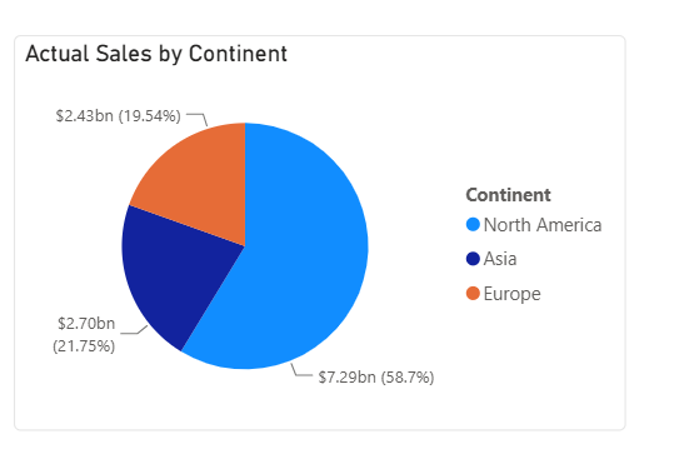
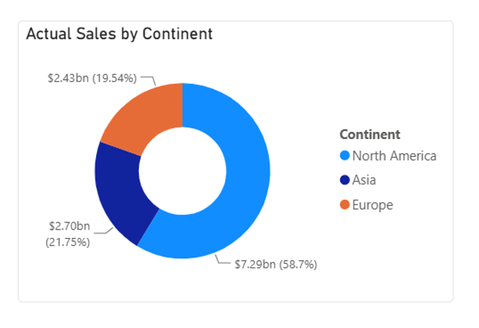
Both read from Power BI semantic models. The difference is context whether the chart is simply showing a flat share of a total or carrying that share against a live planned mix. The running example is a part-to-whole cut of the same sales data for Actual Sales split by Continent, a $12.4bn total divided across North America, Asia, and Europe.
Watch It in Action
Power BI Pie and Donut Charts
Pie and donut share one setup: a category in the legend, a single measure from your Power BI semantic model in Values. Each slice sizes to the measure, labels can show the value and its share, and the visual cross-filters, themes, and tooltips like any other native visual.
Pie chart
The Pie chart divides the circle, so each slice is a category of share of the whole. With value-and-percent labels switched on, it reads cleanly, and for a three-slice split with a clear leader, it does its job well. Detail labels can show the category, the value, the percentage, or a combination; the legend moves to any side and clicking a slice cross-filters the rest of the page. Its limit is the one every pie carries: past four or five slices, or when shares are close, the angles become hard to rank by eye that is a property of the shape, not of Power BI.
Donut chart
The Donut chart is the same division as the center cut out, which trades a little of the angle cue for a lighter, more modern look that sits well on a dashboard. The inner-radius size is adjustable, and the same detail-label and legend controls as the pie apply. In the native visual, though, that center is simply empty space it holds no total, so the hole is style rather than information.
A note on native pie and donut charts
For a simple, few-slice share, native pie and donut are genuinely fine; this is a credibility case, not a gap. The edges are about reach, not competence. The donut hole carries nothing, so there is no running total in the center. Small multiples do not extend to pie or donut, so you cannot trellis one pie per region or per quarter the way you can with a bar or line. And the shape is fixed to a full circle there is no semi-circle or styled variant when the layout needs one.
There are hard rendering caps worth knowing: the visual renders a maximum of 3,500 data points, and within that, a Legend field on its own is reduced to the top 1,000 categories; add a Details field and the reduction tightens to the top 500 legend categories and the top 20 detail labels, with the remainder silently dropped. Conditional formatting is not officially supported on either chart, so slice color cannot be driven by a rule the way it can on a column chart. For a three-continent split none of those matters; for a SKU-level breakdown it does. None of it makes native wrong for the job it is good at; it just marks where the Intelligence Sheet family reaches further.
Pie and Donut Charts in the Intelligence Sheet
The Intelligence Sheet reads from the same Power BI semantic models your existing reports use and builds this family on top of them from one foundation a category and a measure then opens two axes of choice native do not. The shape can be a pie, a donut, or a variable pie; the display mode can be a full circle, a semi-circle, or a custom form. Pie and donut are the same visual switched by a control, and a center total, small multiples, and label formatting layer on top of any of them.
Variable Pie Chart
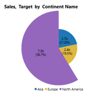
The Variable Pie Chart is the family’s real departure, and the answer to the question a plain circle cannot reach: the slice angle still encodes one measure’s share, but the slice radius encodes a second, so each category is read on two dimensions at once. Angle carries Sales share while radius carries Target, so composition and magnitude land in a single circle instead of two charts a continent holding a modest share on a wide radius is running ahead of what was asked of it, and one holding a large share on a narrow radius is not. It is the reach when a plain pie throws away information you already have, and which measure drives the angle, and which drives the radius is your choice. Like the rest of the family, it renders full-circle, semi-circle, or custom.
| Full Circle | Semi-Circle | Custom |
 | 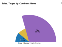 | 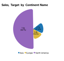 |
Pie Chart
The Pie Chart carries the same part-to-whole read as native but is not locked to a full circle. The full-circle mode is the standard share view; the semi-circle mode folds it into a half, a compact footprint that fits a header strip or sits beside a KPI card without a full circle’s whitespace; and the custom mode opens the geometry start and end angle, gaps between slices, rounded corners, outer padding, and a pie-explosion toggle to emphasize a slice or match a report’s styling. Labels can carry the value, the share, or both; the palette follows the report’s theme, and the explosion toggle pulls a slice out to draw the eye. The share you read is identical across all three; what changes is how the shape fits the page.
| Full Circle | Semi-Circle | Custom |
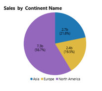 | 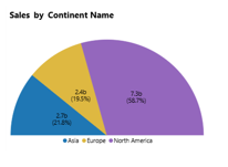 | 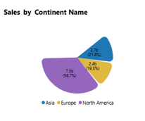 |
Donut Chart
The Donut Chart is the same slices as a hole, and here the hole does work natives cannot. It carries a Total in the center that you can show or hide, so the whole and its parts read in one glance: the reviewer sees the total the shares add up to without looking away from the chart. Like the pie, it renders full-circle, semi-circle, or custom, so a half-donut with the total in the well becomes a neat gauge-style summary for a dashboard corner. The center figure and the slice labels are both configurable, so the donut can headline the total or foreground the shares depending on what the report needs.
| Full Circle | Semi-Circle | Custom |
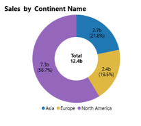 | 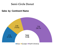 | 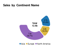 |
The custom mode is driven by a small set of controls start and end angle, pie gap, corner radius, outer padding, and a pie-explosion toggle plus a scroll-to-toggle that flips pie to donut on the same visual. All of it lives in one formatting pane, and the same settings apply to any of the three shapes above.
Small Multiples and Totals
Two capabilities cut across the whole family. Small multiples panel a pie or donut into a grid by row or column one circle per region, channel, or quarter so several part-to-whole cuts compare side by side; native pie and donut cannot trellis at all. And the center total, shown or hidden per report, turns the donut hole into a live figure rather than whitespace. Together with the display modes, they let one configuration serve a header gauge, a styled hero slice, or a small-multiple walls without a rebuild.
The underlying configuration is the same across all of them what changes is the shape, the display mode, and the toggles, giving the full pie and donut family from one visual surface.
Built for the Planning Workflow
Because these charts sit on your Power BI semantic model, they show the composition of the data you already report on today. They go further when that model is paired with a plan: a part-to-whole chart in a planning review is usually asking a mix question is the split across channels or regions the one the business planned for? Which turns the comparison into part of the story rather than a separate chart.
In most reporting builds, that comparison is fixed. The planned mixes a target share for each region; a prior-year split is loaded into the model at the start of the period and sits frozen there while actuals move against it, accurate about the past and silent about every revision since. The variable pie radius and the donut center total are where that fixity shows most, because both are drawn from the comparison rather than from the actual.
Read from a live plan instead, a target reallocated between regions this morning re-sizes the radius and re-bases the center total by the afternoon, with no export and no reconciliation step. The mix a reviewer reads is the mix against the plan as it stands, so the review can close on where the composition needs to shift rather than on reconciling whose number is current.
A pie that redraws when the plan moves are no longer reporting the mix it is showing where the mix has to change.
When to Reach for Which
| If your report needs… | Reach for… |
| A simple few-slice part-to-whole with a clear leader, themed and interactive | Power BI pie or donut |
| A quick share read on an operational dashboard | Power BI pie or donut |
| An interaction-heavy or very large report where native optimization matters | Power BI pie or donut |
| A donut with a running total shown in the center | Intelligence Sheet Donut |
| One pie or donut per region, channel, or period as small multiples | Intelligence Sheet pie/donut |
| Composition plus a second measure share by angle, magnitude by radius | Intelligence Sheet Variable Pie |
| A semi-circle or custom-styled share, or a mix shown against a live planned target | Intelligence Sheet pie/donut variants |
For a simple, few-slice share on a governed model themed, interactive, and free Power BI’s native pie and donut are the right starting point, and for precise comparison across many categories a bar from Episode 04 beats any circle.
For a center total, small multiples, a semi-circle or custom shape, or a second measure carried on the radius and for a mix that stays tied to a live planned target, the Intelligence Sheet is the fit. These are first-class options on one visual rather than separate builds.
Getting Started Pie and Donut Charts in Fabric Intelligence
In the Intelligence Sheet, add a Pie visual and connect it to your Power BI semantic model for the same model your Power BI reports already use. Put your category in the legend, your measure in Values, and a second measure on the radius if you want the variable pie.
Explore the radius first; it is the control that changes what the chart can say, and the one native has no equivalent. From there the shape and display mode are single toggles: pie to donut, full circle to semi-circle to custom, with the center total and small multiples layering on top of whichever you land on. None of it needs a rebuild between them.
What’s Next
Episode 09 stays part-to-whole but trades the circle for rectangles the treemap, where Power BI’s native tiling meets the Intelligence Sheet’s hierarchical variants, and the question becomes how a whole nest into categories and sub-categories at once.
Resources
- Plan in Microsoft Fabric IQ Microsoft Learn official documentation and getting started guides
- Visualize simulations, budgets, and forecasts Microsoft Learn how the Intelligence Sheet updates in real time when planning sheet values change
- Lumel Intelligence the Lumel product page and three-pillar architecture overview
- Foundation Part 1: Introducing the Intelligence Sheet where Plan sits within Fabric IQ
- Foundation Part 2: Inside the Intelligence Sheet Canvas the visual library, data architecture, and series index