
Episode 05 covered the column chart family: comparisons stood vertical, with range, dumbbell, and lollipop layouts that reframe what the column measures first. This is Episode 06: the visual that answers a different question entirely, the line chart.
Where bar and column charts ask who is ahead and by how much, the line chart asks how did we get here? Sales trends by year, margin movement by quarter, channel performance over time: all these starts with the same shape, a line moving across a time axis. Power BI has a strong native Line Chart for standard trend reporting: familiar, flexible, and the right starting point for most operational dashboards. The Intelligence Sheet adds a broader line family designed for management reporting and planning workflows: clustered, stacked, baseline, and variance variants that bring the comparison line closer to the forecast the business is actively managing.
Both read from the same Power BI semantic models; the difference is what each build on tops the plain trend, or the same trend carried on a live plan.
Power BI Line Chart
Power BI’s native Line Chart is the standard visual for showing a measure over time. Place a time field on the axis, add one or more measures, and optionally split by a legend field (channel, region, product) to compare multiple trends across the same time axis.
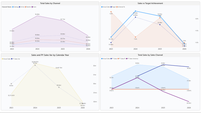
The visual is fast to build and integrates naturally with the rest of the Power BI report experience: slicers, drill through, bookmarks, and tooltips all work as expected. For operational dashboards, it is often enough. A sales manager can see whether revenue is rising; a finance analyst can compare actuals against a target line; a business user can filter by channel and immediately understand direction.
The Analytics pane adds depth beyond the basic trend. A Forecast function, based on exponential smoothing (ETS algorithm), can project future values with a configurable confidence interval: useful for quarterly trend projection directly on the chart, without a separate calculated measure. A Trend line fits a statistical trend to the historical series. Constant and Min/Max reference lines mark fixed thresholds or the data range boundaries.
One formatting option worth knowing: the line’s Join type (under Format > Lines) includes a Stepped setting alongside the default straight line. Stepped interpolation draws a burpee shape between points rather than a diagonal, which is more accurate for data that changes discretely (pricing tiers, inventory levels, approval rate changes) where a straight line between two periods implies a gradual transition that did not happen.
A note on native line charts
Power BI’s native Line Chart does the everyday trend well. The limits appear when a chart needs to carry both the trend and the variance together. A full IBCS line chart (actual trend, prior year, absolute variance (ΔPY), and relative variance (ΔPY%) on one surface) requires either a custom visual, a Deneb specification, or several visuals assembled by hand. That approach can work in a mature BI team, but it introduces extra build effort, extra maintenance, and sometimes governance review. The Forecast and Anomaly detection features from the Analytics pane are both restricted to a standard line chart with a single series on a continuous X-axis: neither works on stacked, area, or combo variants. How a line handles missing data also depends on axis type: a categorical axis shows discrete breaks at missing points, while a continuous axis bridges the gap by drawing through it. These are the limits that drive teams toward the Intelligence Sheet line family.
Line Charts in the Intelligence Sheet
The Intelligence Sheet reads from the same Power BI semantic models your existing reports use and builds this line chart family on top of them. It does not treat a line chart as a single visual type. Instead, it offers multiple line based variants for different analytical questions: simple trends, multicategory comparisons, stacked share movement, variance analysis, and baseline classification.
Simple Line Chart with Variance Analysis
The simple line chart variant combines the trend with variance layers in one visual surface. Actual Sales, Prior Year Sales, absolute variance (ΔPY), and relative variance (ΔPY%) sit in the same chart: the reviewer sees the movement and the business impact together, without looking at a separate visual for the gap.
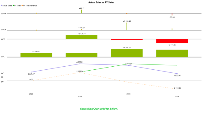
For management reporting, that matters. A line tells the direction. Variance explains whether that direction is acceptable. Keeping both on one surface is what makes this variant the natural reach for finance and leadership decks, where the question is rarely “how did it move?” alone.
100% Stacked Line Chart
A 100% stacked line chart shifts the question from volume to proportion: not how much each category sell did, but how did the share of each category change across the period. Channel mix, product contribution, regional share, when one category appears stable in absolute terms but is losing ground because another grows faster; a 100% stacked line makes that shift visible.
Clustered Line Chart
The clustered line chart supports direct comparison across multiple categories over the same time axis. Multiple city level or channel gross margin trends, for instance, compared across quarters on one surface.
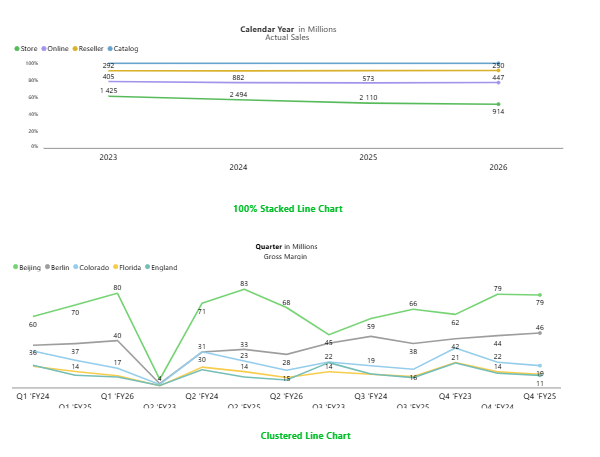
For Power BI users, the multiline comparison is familiar: add a legend field and compare multiple lines. The Intelligence Sheet extends that into a family where the same clustered layout can also support variance layers and planning data connections, without rebuilding the visual from scratch.
Variance Line Chart
The variance line chart is designed for actual versus target, actual versus plan, or actual versus forecast tracking. It plots the actual trend alongside the comparison value and highlights the gap: where performance ran ahead of plan, and where it fell short.
For planning reviews, this is often the chart people actually need. A simple trend might show that sales have increased. But if the target increased faster, the business still missed the plan. The variance line chart makes that relationship explicit: the reviewer sees the actual movement, the comparison trend, the gap between them, and whether that gap widened or narrowed across periods.
Baseline Chart
The baseline chart plots a single measure against an automatically calculated baseline and fills the space between them in green (above) or red (below). Because it derives its own baseline from the series, no second measure is required: it is the fastest way to classify which periods beat their own run rate and which broke from it.
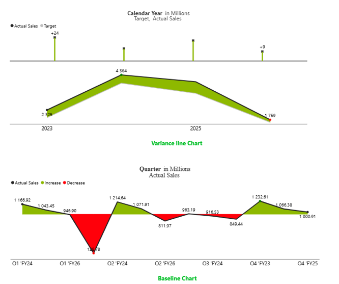
It is especially useful in management packs because it reduces the reading effort. Which quarters have improved? Where did the trend break? Which periods are large enough to explain? The green and red fills answer those questions before anyone reads the axis.
These variants sit alongside the broader three source architecture behind the Intelligence Sheet, semantic models, Planning Worksheets, and Data Apps, so the same line chart that reads a governed model today can be repointed at a live plan without a rebuild.
Built for the Planning Workflow
Because these line charts sit on your Power BI semantic model, they work on the data you already report on today. Sales trends, margin movement, channel performance over time: all that comes straight from the model your existing reports already use. Where they go further is when that model is paired with a plan.
A finance team reviewing monthly actuals against budget, a sales leader comparing the latest forecast quarter by quarter, an operations team tracking volume against capacity assumptions: all these conversations start with a trend. The Intelligence Sheet line family is built for that starting point. The comparison value does not need to be a static measure loaded at build time. It can come from Planning Worksheets: live budgets, revised forecasts, and active scenarios managed directly in the planning layer. When the forecast is revised midway through the month, the variance layer updates with it. That changes the role of the line chart: it becomes a planning review visual, not just a historical trend visual, and the decision it enables is whether performance is still tracking against the plan the business is currently running.
The Planning Difference
Both tools read the line chart from the same Power BI semantic model; the difference is where the comparison value comes from. In most tools, that comparison, a budget, target, or prior year figure, is loaded into the model at the start of the period and sits frozen while actuals move against it.
In a planning workflow, those comparison values are alive. A monthly forecast gets revised when a pipeline thins; a target is adjusted after leadership review; a scenario is swapped in as conditions shift. If the report is built against a static model, the trend is evaluated against a plan that may already have changed. The line is historical, but the benchmark it should measure against is not.
Because the Intelligence Sheet connects directly to Planning Worksheets, the comparison line reflects the current planning context. A target revised this morning rebases every connected line chart by the afternoon, with no export and no reconciliation step. When a forecast changes, the variance layer updates with it, and the reviewer sees the trend relative to the plan the business is currently running, not the one that was set at the start of the period.
A line chart that keeps pace with the plan it measures is a planning instrument, not a reporting artefact.
When to Reach for Which
| If your report needs… | Reach for… |
| A simple sales, margin, or quantity trend over time | Power BI Line Chart |
| A clean operational dashboard trend using semantic model data | Power BI Line Chart |
| Multiple category trends with standard filtering, slicers, and tooltips | Power BI Line Chart |
| A stepped line for discrete change data (pricing, inventory, rate changes) | Power BI Line Chart |
| Actual vs target line analysis with built in variance storytelling | Intelligence Sheet Line Chart |
| Baseline, stacked, clustered, and variance line variants in one visual family | Intelligence Sheet Line Chart |
| Planning connected trend reporting using actuals, budget, forecast, and scenarios | Intelligence Sheet Line Chart |
| Management reporting where trend and variance need to be read together | Intelligence Sheet Line Chart |
For operational dashboarding, Power BI’s native Line Chart remains the right starting point. It is simple, familiar, and works well when the goal is to show movement over time from a governed semantic model.
For planning connected reporting, the Intelligence Sheet is the better fit. It brings the line chart closer to the budget, forecast, target, and scenario data that business users are actively managing, which makes the trend more useful in finance reviews, performance meetings, and management packs.
Getting Started Line Charts in Fabric Intelligence
In the Intelligence Sheet, add a Line visual and connect it to your Power BI semantic model, the same model your Power BI reports already use. Bind your time field to the category axis, add your actual measure, then add the comparison measure or planning value (target, budget, forecast, or prior year).
Key capabilities:
Simple Trend with Variance. Add Actual and Prior Year (or Target) and the chart automatically produces the ΔPY and ΔPY% variance layers alongside the trend, in IBCS notation, without a second visual.
Clustered Lines. Compare multiple categories (channels, regions, cities) across the same time axis. The same clustered layout can connect to Planning Worksheets for planning connected multicategory trend analysis.
100% Stacked Line. Switch to the stacked variant when the story is about sharing or mix over time rather than absolute volume: how channel contribution shifts across quarters.
Variance Line. Use when the trend must be evaluated against plan, target, budget, or forecast, with the gap between the actual and the comparison rendered directly on the chart.
Baseline Mode. Use when the story is about positive and negative movement around a reference point. The baseline calculates automatically from the series: no second measure is needed.
What’s Next
Episode 07 fills in the space beneath the line: the area chart, where Power BI’s standard layouts meet the Intelligence Sheet’s base and variance area variants that make the gap between actuals and plan the visual itself.
Resources
- Plan in Microsoft Fabric IQ: Microsoft Learn: official documentation and getting started guides
- Lumel Intelligence: the Lumel product page and three pillar architecture overview
- Foundation: Part 1 Introducing the Intelligence Sheet: where Plan sits within Fabric IQ
- Foundation: Part 2 Inside the Intelligence Sheet Canvas: the visual library, data architecture, and series index
- Episode 05 Column Chart Family: the previous episode in the series