
Episode 06 covered the line chart: the trend, read as a line moving across time. This is Episode 07: the same trend with the space beneath it filled in, the area chart.
An area chart is a line chart with the region under the line shaded, and that shading changes what the eye reads first. A line highlights the path; an area emphasizes the volume under it, the accumulated weight of the measure over time. Stack the areas and the chart turns into a composition story: not just how the total moved, but how each part contributed to it across the period. Power BI ships the three standard layouts: area, stacked area, and 100% stacked area. The Intelligence Sheet ships the same three, then keeps going into base and variance areas that fold the comparison straight into the fill.
Both read from Power BI semantic models. The difference is context: whether the area is simply carrying a volume story or shading the gap between actuals and a plan that finance is still managing. The running example continues from Episode 06: quarterly Actual Sales across Store, Online, Reseller, and Catalog, measured against Target and PY Sales, now with the area beneath the line carrying the weight.
Power BI Area Charts
Power BI treats the area chart as a member of the line family: place a time field on the axis, add one or more measures from your Power BI semantic model, and the space under each line fills in. The whole native formatting surface comes with it (data labels, legend, axis and gridline control, tooltips, drill down, and small multiples) and the visual emphasizes the magnitude of change over time, showing cumulative totals once stacked.
Area chart
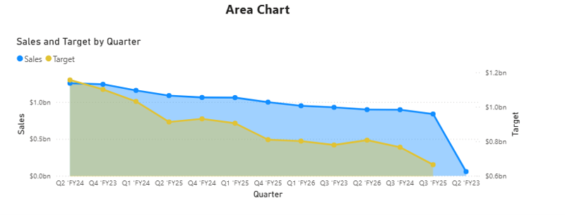
The Area chart fills the region under a single measure, so the height and the shaded mass both read as size. That filled mass is what makes the chart useful: it puts the scale of a series in front of the reader, not just its direction, which is why it suits one headline trend (total revenue, volume, or headcount over time) where you want the weight of the number to land. Here Actual Sales carries the fill and Target rides on top as a line, because filling both areas would have the front one obscure the one behind it. That occlusion is the basic area chart’s defining limit: Microsoft’s own guidance notes that when two series sit close together, the areas overlap and hide each other, which is why a second measure usually becomes a line. Reach for it when a single measure is the story, and its magnitude is the point.
Stacked area chart
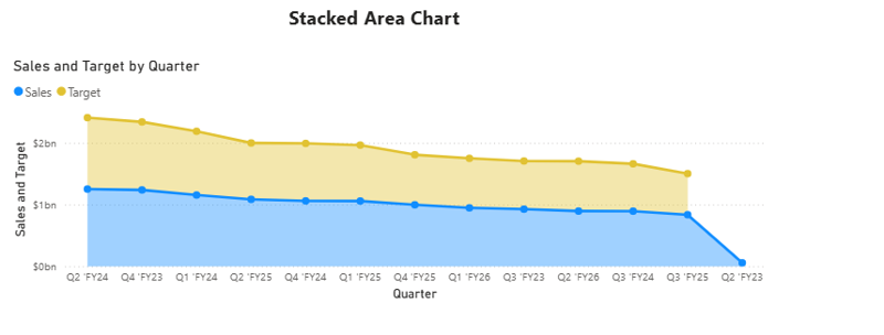
The Stacked area chart lays out the measures on top of one another, so the outer edge carries the total, and each band carries a contribution. It is the right reach when both the aggregate trajectory and the rough split that drives it matter over time (total revenue and the channels feeding it across quarters) answering “how did the total move, and what was underneath it?” in a single shape. Its caution is the one stacking always carries: only the bottom band sits on a flat baseline, so the bands above it are hard to measure precisely from one period to the next. Read it for shape and contribution, not for exact per band values.
100% stacked area chart
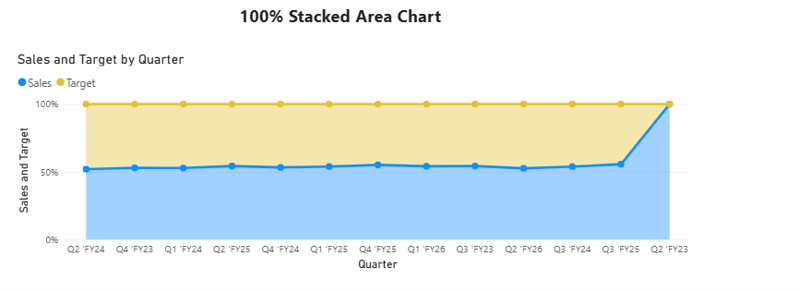
The 100% stacked area chart normalizes every period to full height and shows each band as a share, so the chart reads as mix over time rather than volume over time. That makes it the reach for share questions (is the business growing more dependent on one channel, is a product line gaining ground) where the proportion matters more than the absolute number. Labels render as percentages, and the shared 0 100% axis keeps every period directly comparable, with magnitude deliberately removed, so a genuine shift in mix is not masked by overall growth.
A note on native area charts
The three native area layouts are solid for operational dashboards and need no external dependency. Two edges matter for planning work. First, when a native area chart already carries more than one measure, those measures occupy the legend: so you cannot also break the area out by a business category like channel in the same visual; it is multiple measures or one measure split by a legend, not both. Second, there is not built in variance or IBCS notation: a chart that shows actual against target and the gap between them, in the IBCS convention, needs a custom visual, a Deneb spec, or several visuals assembled by hand. The native area also defaults to straight edged fills between data points; a smooth (curved) fill is available via Format > Lines > Join type for gradual trends where the curved boundary reads more naturally. Analytics pane support varies by variant: the standard Area chart accepts trend lines and reference lines (min/max/average/median/percentile), while the Stacked Area and 100% Stacked Area variants lose access to those and keep only constant lines. Forecast and Anomaly detection are not available on any area chart variant.
Area Charts in the Intelligence Sheet
The Intelligence Sheet reads from the same Power BI semantic models your existing reports use and builds the area family on top of them from one foundation: the same Category and Measure configuration across every variant, with the chart type switch determining the layout. It also removes the native constraint above: a single area visual can break Actual out by channel and layer Target, prior year, and variance on top, with the analytics layer (reference and trend lines, Pareto) and IBCS formatting (solid actuals, outlined budget, hatched forecast, green/red variance) available on whichever layout you pick.
Area Chart
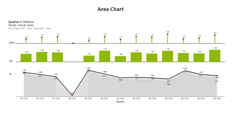
The Area Chart does what native cannot do in one visual: it fills Actual Sales and prior year as areas and stacks the IBCS variance directly above (an absolute variance band (ΔPY) and a relative variance row (ΔPY%)), so the trend and its full variance read together without a second chart. For management reporting that is the point: a line tells the direction, but the variance layers tell the reviewer whether that direction is acceptable, and here both land on one surface instead of a trend that points elsewhere for the gap. It removes the assembly a native IBCS layout would take and keeps the notation consistent across every report. (Integrated variance treatment in area form; dedicated variance bars, pin charts, and deviation arrows in Episode 02 )
Stacked Area Chart
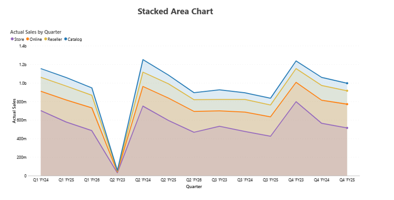
The Stacked Area Chart breaks Actual Sales into its channel bands (Store, Online, Reseller, Catalog) stacked across quarters, with the legend and band labels by default. This is exactly the category plus measure breakdown native makes you choose against, which makes it the reach when the question is where growth is coming from over time, not just whether the total rose. The composition and its movement read in one visual; the outer edge still carries the total, and every band stays labelled, so contribution is read rather than estimated.
100% Stacked Area Chart
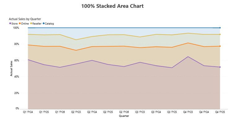
The 100% Stacked Area Chart normalizes those channel bands to full height, turning the same data into a mix over time to read: which channel dominates the quarter, and how that weighting drifts across the period. It is useful precisely when absolute sales hide the story: a channel can hold its revenue and still lose share as another grows faster, and this view surfaces that erosion immediately. Shares print on the bands and the 0 100% axis keeps every quarter comparable, making it a natural input to planning conversations about where demand or investment is shifting.
Base Area Chart
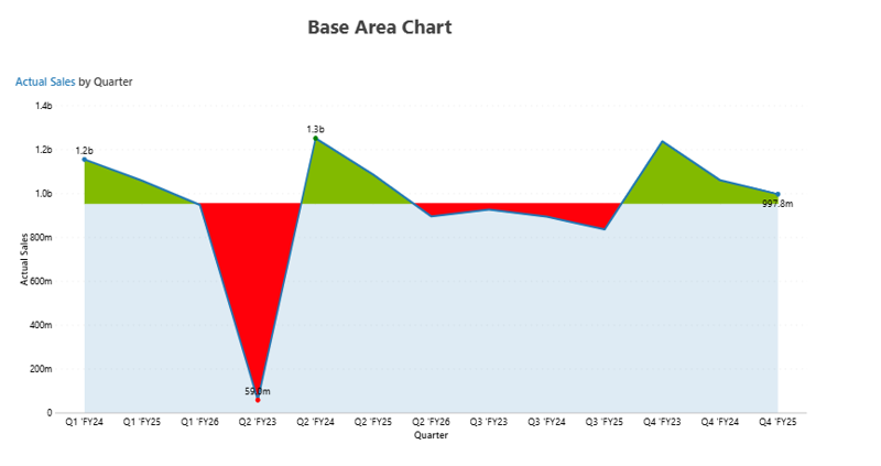
The Base Area Chart plots a single measure against an automatic baseline and fills the difference: green where Actual sits above the line, red where it falls below. Because it finds the deviation from the series’ own run rate without a second measure, it is the fastest way to spot which periods beat expectations and which broke. The steep red plunge and the green peaks land before anyone reads an axis. Reach for it for anomaly and momentum reads, where the question is each period against its own normal rather than against a plan.
Variance Area Chart
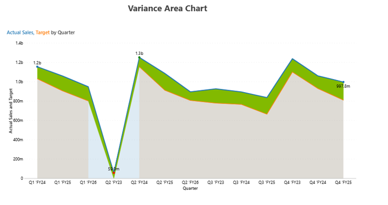
The Variance Area Chart shades the gap between two measures (Actual Sales against Target) so the area is the variance: widening when the lead grows and pinching to nothing where the lines cross. Unlike the base area, it needs a comparison measure to work give it Actual and Target, and it fills the space between them across every quarter, turning actual versus plan tracking into a single shape where the size and direction of the gap are the headline. It is the chart a planning review usually wants not the trend alone, but how far performance ran from what was committed, quarter by quarter.
All five variants of area, stacked, 100% stacked, base, and variance come from the same field configuration: the chart type switch changes the layout, the data bindings stay put, and nothing needs to be rebuilt between them.
Built for the Planning Workflow
Because these areas sit on your Power BI semantic model, they carry the volume and mix stories on the data you already report on. They go further when the model is paired with a plan: the comparison the base and variance areas shade against is one finance is still managing a target trimmed when a quarter softens; a forecast lifted when a channel runs hot. When that target is revised, the variance band redraws against the new figure on the spot and an annotation record, so the review closes a decision rather than a reconciliation.
The Planning Difference
Both tools read the area from the same Power BI semantic model; the difference is where the comparison comes from. A native area chart shades against a comparison (target, budget, prior year) loaded into the semantic model at build time and held until the next refresh: accurate about the past, silent about any revision since. Mid period those values rarely hold still, and a static semantic model only catches up at the next refresh.
When the comparison is read from a live plan instead, a target revised this morning re shades the gap in every connected report by the afternoon, without an export or reconciliation step: the variance is against the plan as it stands, not as it stood at build time.
An area chart that keeps pace with the plan it measures is a planning instrument, not a reporting artefact.
When to Reach for Which
| If your report needs… | Reach for… |
| Volume, total, or mix over time on a standard report, themed and interactive | Power BI area charts |
| A stacked or 100% stacked composition trend built in a few clicks at no marginal cost | Power BI area charts |
| An interaction heavy or very large report where native optimization matters | Power BI area charts |
| Actual and prior year with the full IBCS variance (ΔPY, ΔPY%) layered in one area | Intelligence Sheet Area Chart |
| A single measure classified above or below its own baseline, green and red | Intelligence Sheet Base Area Chart |
| The gap between Actual and Target shaded as the area itself, across time | Intelligence Sheet Variance Area Chart |
| An area shaded against a target that updates when the underlying plan is revised | Intelligence Sheet area variants |
For volume, total, and mix over time on a governed semantic model (themed, interactive, and free), Power BI’s native area charts are the lower friction choice and read cleanly for most operational dashboards.
For an area that has to carry its own variance (IBCS layers, a classified baseline, or a shaded actual versus target gap) or to break a measure out by category while still layering a comparison, the Intelligence Sheet is the fit. These are first class chart types rather than assembled workarounds, and the comparison of the area is shaded against stays tied to the live plan.
Getting Started Area Charts in Fabric Intelligence
In the Intelligence Sheet, add an area visual and connect it to your Power BI semantic model for the same model your Power BI reports already use. Bind your time field to the axis, add your actual measure, then add the breakdown or comparison (a channel for the stacked variants, Target or prior year for the variance variants). Switching between area, stacked, 100% stacked, base, and variance is a chart type toggle: no rebuild between variants.
Once your visual is placed, these are the key capabilities to explore for area reporting:
Area Variants. All five layouts come from one configuration: switch to fit the story (volume, mix, or gap) without rebuilding.
Category + Measures Together. Break a measure out by channel and layer comparison measures in the same visual: the combination native makes you choose against.
IBCS Variance Layers. Stack absolute (ΔPY) and relative (ΔPY%) variance above the trend in consistent IBCS notation.
Base & Variance Modes. Classify one measure against its own auto baseline in green and red or shade the gap between Actual and Target as the area itself.
What’s Next
Episode 08 turns from trend to part and donut family, where Power BI’s native slices meet the Intelligence Sheet’s half, multi-level, and nested donut variants, and the question shifts from “how did it move?” to “what is it made of?”
Resources
- Plan in Microsoft Fabric IQ: Microsoft Learn: official documentation and getting started guides
- Lumel Intelligence: the Lumel product page and three pillar architecture overview
- Foundation: Part 1 Introducing the Intelligence Sheet: where Plan sits within Fabric IQ
- Foundation: Part 2 Inside the Intelligence Sheet Canvas: the visual library, data architecture, and series index
- Episode 06 Line Charts: the previous episode in the series