Episode 01 introduced KPI cards: the first visual most executives look at in any report. This is Episode 02: the chart that gets the most attention in any management review, the one showing the gap.
Before anyone asks about trends or breakdowns, they want two things at once: how big the difference is, and whether it is big enough to act on. Variance and deviation charts answer both. Power BI can approximate this through a combination of native visuals. The Intelligence Sheet brings the full IBCS variance layout into a single configurable visual: integrated absolute and relative variance, pin charts, deviation arrows, and overlapped bars, without assembly work or custom visual installs.
Both read from Power BI semantic models. The difference is context: what the variance is measured against, and whether that plan is still live.
Power BI — Variance and Deviation
Power BI does not have a single native visual for IBCS variance layouts. The closest approaches combine existing visuals to approximate the look.
Clustered Bar Chart — side-by-side layout
The most common approach is a side-by-side Clustered Bar Chart layout: one chart each for Actuals (AC), Prior Year (PY), absolute variance (ΔPY), and relative variance (ΔPY%), sharing the category axis. Together they form a four-column variance view that mirrors the IBCS reference layout, with conditional coloring applied to the variance columns for favorable and unfavorable performance.
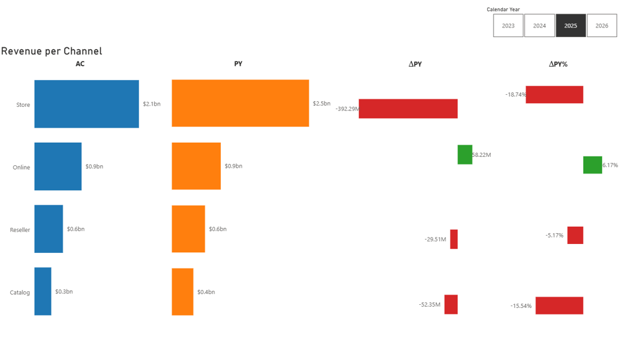
This approach delivers the core information, which channels beat plan, which missed, and by how much, but the layout requires manual alignment across separate visuals, and consistent bar widths and zero-line anchoring across all four columns are difficult to maintain as data changes.
Table visual with conditional formatting
A faster alternative for dense operational reports is the Table visual with data bars. Adding the category and the four measures to a table, then applying data-bar conditional formatting to each numeric column, produces a compact variance grid quickly. It shows direction and magnitude without separate charts, useful where space is constrained, though it reads as a data table rather than a chart, which reduces the visual scannability executives expect from variance summaries.
A note on pixel-perfect IBCS in Power BI
True integrated IBCS compliance, consistent bar widths, proper zero-line tick marks, pin charts for relative variance, deviation arrows between bars, requires either heavy DAX workarounds or a custom visual such as a Deneb Vega-Lite spec. Custom approaches work but carry maintenance overhead, require developer skills, and may need a security review in governed environments.
Variance and Deviation in the Intelligence Sheet
The Intelligence Sheet brings the full IBCS variance layout into a single visual, built from the same foundation across all variants: Category, Actuals, and Comparison fields, with the chart type and measure configuration determining which variant you get.
The Split Bar chart type produces the full integrated variance layout: Actuals, Prior Year, absolute variance (ΔPY), and relative variance (ΔPY%) as four aligned columns in one visual. The absolute variance renders as a standard bar; the relative variance renders as a Pin Chart, the IBCS convention for percentage deviations as thin pins extending from a zero line. Both sit in the same visual surface, with no manual alignment.
Switching to the Overlapped Bar chart type collapses Actuals and Prior Year into a single overlapped column, with the relative variance as the headline. This compact variant fits well in space-constrained layouts: dashboard cards, mobile reports, or audiences focused on percentage performance rather than dollar magnitude.
For Actuals vs Target reporting, the Clustered Bar chart type adds a Deviation Arrow between the two bars in each row, showing the absolute gap and the percentage difference in a single mark, with IBCS-standard green and red for favorable and unfavorable performance.
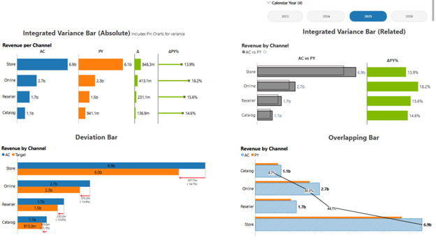
An Analytics layer is available across all variants, adding reference lines, trend lines, error bars, and Pareto curves on top of the same visual. A Pareto overlay turns a channel comparison into a contribution analysis without a second chart.
The underlying configuration is the same across all variants. What changes is the chart type switch, giving four distinct IBCS layouts from a single visual surface, with no rebuild required between them.
Built for the Planning Workflow
Variance charts sit at the heart of every planning review: they answer whether the team hit its budget, missed its forecast, and by how much. In a monthly management pack, that is not a historical question; it is a live one, because the forecast gets revised as the period progresses.
Because the Intelligence Sheet connects directly to Planning Worksheets, the variance columns reflect the latest forecast rather than the one locked at period start. When the finance team revises targets in the Planning Sheet, the deviation bars update immediately across every connected report, no manual refresh, no export, no reconciliation step. Annotations can be attached at the channel or time-period level, giving the reviewer context on a specific variance in the same place it appears, rather than in a footnote or a separate slide.
The Planning Difference
Variance charts in most reporting tools answer a historical question: how did actuals compare to a fixed target that was set in the past? The target lives in the data model; it does not change unless someone manually updates it and waits for the next refresh.
In a planning workflow, the question is different. The forecast is still being managed. As a period progresses, the finance team revises it, pulling back a revenue expectation here, adjusting a cost line there. The variance between actuals and the current forecast is a moving measure, not a settled one. A management pack built on a static semantic model snapshot cannot reflect that; by the time it is published, the numbers it shows may already be out of date.
Because the Intelligence Sheet connects directly to Planning Worksheets inside Fabric Plan, the variance columns reflect the current state of the forecast, not the one locked when the report was last refreshed. A budget revision entered this morning surfaces in the deviation bars this afternoon. The person reviewing the report sees the same numbers the person managing the plan is working with.
That alignment, between the plan being managed and the report measuring it, is what makes variance charts in the Intelligence Sheet a planning instrument rather than a reporting artefact.
When to Reach for Which
| If your report needs… | Reach for… |
| A quick variance view for ad-hoc or exploratory analysis | Power BI clustered bar chart |
| A compact variance grid in a dense operational dashboard | Power BI table with data bars |
| A recurring management pack or board-ready variance report | Intelligence Sheet variance visuals |
| Integrated IBCS variance bars: absolute and relative in one visual | Intelligence Sheet variance visuals |
| Pin charts, deviation arrows, or overlapped bars without a custom visual install | Intelligence Sheet variance visuals |
| Variance that updates automatically when the plan is revised in Fabric Plan | Intelligence Sheet variance visuals |
For one-off analytical work or dashboards where strict IBCS conventions are not required, Power BI’s native visuals are the practical starting point: fast to build, familiar, and production-ready.
For recurring management reporting, executive variance views, or any layout that demands IBCS consistency (integrated bars, pin charts, deviation arrows), the Intelligence Sheet is the fit. These are the visual conventions it was built around, available as first-class chart types rather than workarounds.
Getting Started — Variance and IBCS Bars in Fabric Intelligence
Open a Plan item in any Fabric workspace and add a Split Bar visual from the Intelligence Sheet visual library. Assign your Category, Actuals, and Comparison fields. Switching between integrated variance (Split Bar), compact overlapped layout (Overlapped Bar), and deviation arrows (Clustered Bar) is a chart type toggle, no rebuild needed between variants.
Once your visual is placed, these are the key capabilities to explore for variance reporting:
IBCS Formatting. IBCS notation applies automatically: solid fills for actuals, outlines for prior year or budget, hatching for forecasts, and green/red semantic coloring for favorable and unfavorable variances. Each convention can be customised, but the defaults are production-ready from the first data binding.
Pin Charts. The relative variance column (ΔPY%) renders as a pin chart by default: thin pins extending from a zero line, the IBCS standard for percentage deviation. This keeps the absolute and relative variance visually distinct within the same row without adding a second chart.
Conditional Formatting. Threshold-based rules can be layered on top of the IBCS base, flagging variances that exceed a defined percentage, highlighting outlier channels, or dimming rows that are within tolerance. Rules respond dynamically as the underlying plan is revised.
Analytics Layer. Reference lines, trend lines, and Pareto curves can be added on top of any variance variant without switching visuals. A Pareto overlay turns a channel variance view into a contribution analysis, showing which channels account for the majority of the gap, in the same visual surface.
If your organization is not yet on Fabric, Microsoft offers a 60-day trial to evaluate Plan on real data before committing.
[!NOTE] Plan and the Intelligence Sheet are currently in public preview. The canvas is ready for internal use, but some features and workspace configurations may have limitations. Check the Microsoft Learn documentation for the current preview status before deploying in a production environment.
What’s Next
Episode 03 covers combo charts: where Power BI’s line and column combination meets the Intelligence Sheet’s multi-axis and Pareto variants, and when the layered approach changes the story a single chart tells.
Resources
- Plan in Microsoft Fabric IQ: Microsoft Learn: official documentation and getting started guides
- Lumel Intelligence: the Lumel product page and three-pillar architecture overview
- Foundation: Part 1 — Introducing the Intelligence Sheet: where Plan sits within Fabric IQ
- Foundation: Part 2 — Inside the Intelligence Sheet Canvas: the visual library, data architecture, and series index
- Episode 01: KPI Cards: the previous episode in the series