The foundation posts introduced the Intelligence Sheet: Plan’s native visualization canvas inside Fabric IQ, and what it means for reporting on top of planning data. This is Episode 01 of the visual-by-visual series: the KPI card, the first thing most executives look at in any report.
Before anyone checks a trend line or drills into a table, they want to know one thing: are we performing well? KPI cards answer that question at a glance. Power BI has two native options for this job: the Card visual and the KPI visual. As of November 2025, the Card visual became generally available as a single, unified visual that handles both single-measure and multi-measure cards, replacing the older legacy Card and Multi-Row Card visuals. The Intelligence Sheet adds its own set of KPI visuals designed for planning-connected reporting: actuals alongside budgets, targets, forecasts, and variance in a single interactive tile.
Both read from Power BI semantic models. The difference is context: what the KPI sits next to, and what it needs to show.
Power BI KPI Visuals
A KPI card shows the current value of an important business metric, usually with context such as a target, previous period, variance, trend, or status. Power BI has two current native visuals for this job.
Card Visual
The Card visual became generally available with the November 2025 Power BI release, replacing two older legacy visuals: the single Card and the Multi-Row Card. When you select the Card icon in the Visualizations pane today, this is what you get.
It handles both single and multiple measures in one visual. A single tile can display Actual Sales, Budget, Target, Previous Year values, and variance together, with reference labels, categories, and optional images. It also supports multi-level categories, making it suitable for segmented dashboards across regions, product lines, or sales channels.
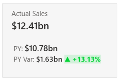
For a quick single-number view, a single prominent metric with no additional context, the same visual works by simply adding one measure to the Values field.
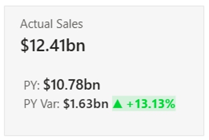
Legacy note: The Multi-Row Card and the classic single Card visual still exist. They have not been removed. Existing reports using either visual continue to work unchanged. They are hidden from the default Visualizations pane but remain accessible: select the three dots (…) in the Visualizations pane and choose Restore default visuals. They are not recommended for new reports, as the current Card visual covers both use cases in one.
KPI Visual
The KPI visual communicates a single measure against a target and shows trend direction over time. It is useful for dashboards where decision-makers need to quickly assess whether performance is meeting expectations and how it is moving over a defined time axis such as months or quarters.
KPI Visuals in the Intelligence Sheet
KPI visuals in the Intelligence Sheet are designed for a different reporting context, one where the numbers on the card are not just actuals from a semantic model, but actuals sitting alongside budgets, forecasts, and plan scenarios that live inside Fabric Plan.
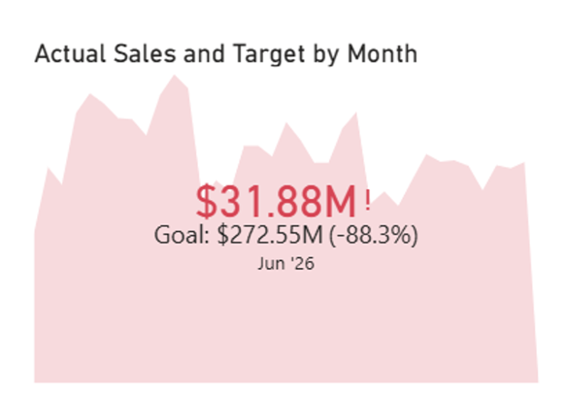
As covered in the foundation posts, the Intelligence Sheet connects simultaneously to three data sources: semantic models, Planning Worksheets, and Data Apps, all on the same Fabric foundation, always reconciled. KPI visuals in this canvas reflect that: a single tile can show the current actual, the budget, the forecast, the variance to plan, and a trend sparkline, pulling from all three sources without a manual sync.
The visual library includes KPI cards with embedded sparklines, multi-KPI scorecard tiles, number cards, and gauge-style visuals for target tracking. Formatting follows IBCS standards out of the box: solid fills for actuals, outlines for budget, hatching for forecasts, keeping notation consistent across every report regardless of who built it. Trellis layouts allow the same card to be segmented by region, product, or channel within a single visual.
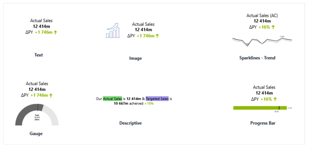
These visuals also support narrative annotations, commentary that attaches at the measure or data-point level, persists across report refreshes, and can write back to the database for audit and lineage. For finance and leadership reporting where a number without context is often not enough, that combination of planning data and in-context commentary is what the Intelligence Sheet KPI visuals are built for.
Built for the Planning Workflow
A leadership dashboard connected to a live plan needs more from a KPI card than a static number. Finance teams need to see the actual alongside the budget it was set against, the forecast that reflects current expectations, and the variance between them, all in one tile, always current.
Because the Intelligence Sheet connects directly to Planning Worksheets, that reconciliation is automatic. A budget revision entered in the Planning Sheet surfaces in every connected KPI card without a refresh step. Annotations can be attached at the measure or time-period level, giving context to variances in the same place they appear, rather than in a separate deck or email thread. For a CFO or operations lead reviewing a monthly management pack, that combination of live planning data and in-context commentary is what turns a number into a decision.
The Planning Difference
KPI cards in most reporting tools show you where you are. KPI visuals in the Intelligence Sheet show you where you are relative to where you planned to be, because the budget, forecast, and scenario data live in the same canvas, always reconciled. When a planner updates a forecast in the Planning Sheet, the KPI card reflects it immediately, without an export, refresh, or manual step.
That is the difference between reporting on a plan and reporting inside one.
When to Reach for Which
Power BI and the Intelligence Sheet serve different reporting contexts, and KPI visuals reflect that distinction clearly.
| If your report needs… | Reach for… |
| A single prominent number on an operational dashboard | Power BI Card visual |
| Multiple metrics in a compact tile on a standard Power BI report | Power BI Card visual |
| A KPI tracking performance against a target over time | Power BI KPI visual |
| KPIs that display actuals alongside budget and forecast from Plan | Intelligence Sheet KPI visuals |
| IBCS-certified management pack formatting across cards and charts | Intelligence Sheet KPI visuals |
| Scorecard layouts with sparklines, variance, and narrative commentary | Intelligence Sheet KPI visuals |
| Planning-focused performance reporting for finance or leadership review | Intelligence Sheet KPI visuals |
If the report lives in Power BI and the job is operational dashboarding on a semantic model, the native visuals are the right starting point: they are production-ready, familiar to users, and fast to build.
If the report needs to sit inside the planning workflow (where the numbers on the card need to reflect what the team has budgeted, what they have forecast, and how actuals are tracking against that plan), the Intelligence Sheet KPI visuals are the fit. That is the context they are built for.
Getting Started — KPI Cards in Fabric Intelligence
Open a Plan item in any Fabric workspace, select a blank canvas, and add a KPI card visual from the visual library. Connect it to your semantic model, Planning Worksheet, or both. The canvas reconciles all three data sources automatically, so no additional configuration is needed to pull actuals alongside budgets and forecasts in the same tile.
Once your visual is placed, these are the key capabilities to explore for KPI reporting:
Sparklines. Embed a trend line directly inside the card tile, showing how the metric has moved over time without adding a separate chart. Sparklines pull from the same data source as the KPI value and update automatically when the underlying data or plan changes.
IBCS Formatting. Solid fills for actuals, outlines for budget, and hatching for forecasts apply automatically when the card is connected to planning data. Semantic green and red coloring for favorable and unfavorable variances is built in, keeping notation consistent across every card in the report.
Trellis Layout. The same KPI card can be segmented by region, product line, or sales channel within a single visual, displaying one tile per category. Each tile shows the same measures for its segment, making cross-category performance visible at a glance without building separate cards for each.
If your organisation is not yet on Fabric, Microsoft offers a 60-day trial to evaluate Plan on real data before committing.
[!NOTE] Plan and the Intelligence Sheet are currently in public preview. The canvas is ready for internal use, but some features and workspace configurations may have limitations. Check the Microsoft Learn documentation for the current preview status before deploying in a production environment.
What’s Next
Episode 02 covers variance and IBCS bars: the visual type where the Intelligence Sheet has no native Power BI equivalent at all, and the one most finance teams reach for first when Power BI’s native options fall short.
Resources
- Plan in Microsoft Fabric IQ: Microsoft Learn: official documentation and getting started guides
- Lumel Intelligence: the Lumel product page and three-pillar architecture overview
- Foundation: Part 1 — Introducing the Intelligence Sheet: where Plan sits within Fabric IQ
- Foundation: Part 2 — Inside the Intelligence Sheet Canvas: the visual library, data architecture, and series index