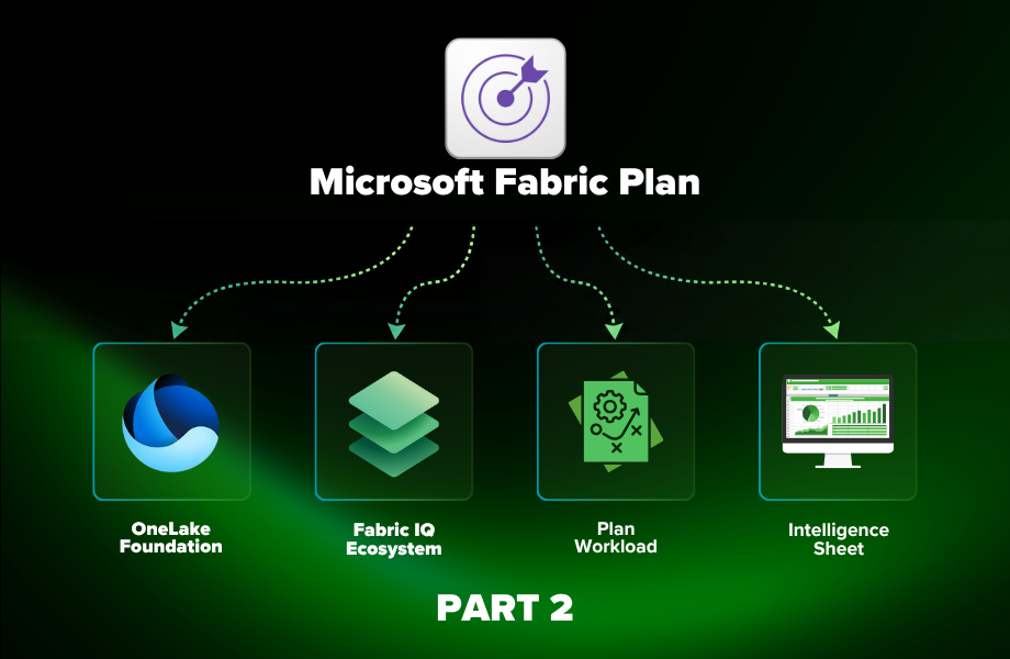
Part 1 covered where the Intelligence Sheet sits within Microsoft Fabric Plan: the three-world fragmentation it addresses, how Lumel and Microsoft built it as a first-party Fabric workload, and how to get access. This is Part 2: why the native integration changes what the canvas can do, and what’s actually inside it.
Why it moved inside Fabric
Inforiver Analytics+, the chart engine inside the Intelligence Sheet, has been available as a Power BI custom visual for years. The visual library is the same. So, what does bring it natively inside Plan actually change?
The answer is integration. A custom visual draws charts on top of analytical data. The Intelligence Sheet draws charts inside Plan, sitting as a first-class item alongside Ontology, Graph, Data Agent, Operations Agent, and Power BI Semantic Models, and that changes what the reporting layer can do entirely. Microsoft positions Plan as the item that “connects data to decisions and helps you translate insights to actions efficiently”. In practice, that means Plan can:
- Connect directly to existing Power BI semantic models for plan-versus-actuals analytics, with dimensions and measures available without rebuilding
- Write back to Fabric SQL databases with workflow approvals and audit trails: first-class data persistence, not just visual writeback
- Share the ontology that grounds Data Agents and Operations Agents, so AI assistants understand the plans they’re reading
- Feed signals from real-time intelligence into coordinated actions through the Operations Agent
- Use OneLake mirroring and shortcuts, so source data stays in place, no ETL, no copies
The Intelligence Sheet draws those same charts within the Plan, sitting inside the Fabric IQ stack where planning, data, and decisions come together. That’s what native integration unlocks. Same chart engine; a fundamentally different reporting context.
That last point about AI carries more weight than it might first appear. When a Data Agent answers a question about performance, or an Operations Agent flags a variance and recommends an action, it reasons against the same plans, ontology, and numbers that Intelligence Sheet reports are built on. Reports here aren’t just for human readers: they’re part of the governed context that AI agents act within.
Inside the Intelligence Sheet Canvas
One view, three data sources
What makes the Intelligence Sheet architecturally different from a standard reporting canvas is where it reads its data from. Lumel describes it as one view, three data sources, always reconciled: the canvas connects simultaneously to:
- Semantic models: actuals and transactions from Power BI semantic models
- Planning Worksheets: budgets, forecasts, and scenarios entered directly in Plan
- Data Apps: reference data and governed lookups managed in Data Management
Because all three live on the same Fabric foundation, there is no import step or sync cycle. A variance updates the moment any source changes, and every chart on the canvas can draw from all three sources at once.
The visual library
The library spans three tiers: standard, advanced, and IBCS. Each adds depth without requiring a separate install.
Standard chart families
Bar, column, line, area, pie, donut, scatter, and bubble: the core types covering most common reporting needs, all with full semantic model bindings and standard interactions.
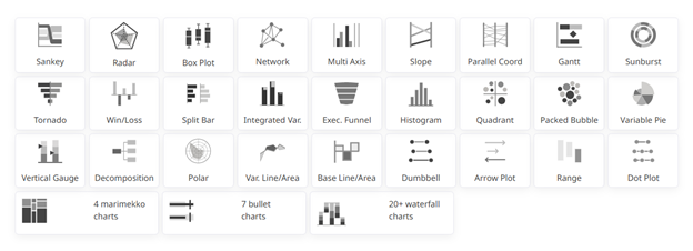
Advanced and specialty charts
The full Inforiver chart library is available here, the same depth that report builders had been installing as a custom visual for years, now built in. Variance and deviation bars for IBCS-compliant management packs, Sankey and Network charts for flow and dependency analysis, Marimekko for market and revenue breakdowns, over 20 waterfall variants for financial storytelling, and specialist types (Box-and-Whisker, Violin, Parallel Coordinates, Decomposition) for analytical work that usually required a separate tool. Every chart in this tier scales to 30,000+ data points.
IBCS-certified formatting
Single-click compliance with International Business Communication Standards. Solid fills for actuals, outlines for budgets, hatching for forecasts, with integrated deviation columns. Consistent notation across every report regardless of who built it.
Financial reporting
Matrix as a financial reporting tool
Finance teams can build reports the way they need them: calculated columns, proper accounting sign conventions, custom number formatting, and subtotals at every hierarchy level. Dimension layouts can be rearranged without touching the data model, and cell, row, and category formatting is fully configurable. The result looks like a report your finance team authored, not a BI tool’s best approximation of one.
Paginated financial reports
Structured P&L statements, balance sheets, and management reports with configurable headers, footers, and section breaks. Designed for statutory and board-ready output without a separate authoring tool.
Variance analysis
Budget vs. actual, forecast vs. actual, and period-over-period variances calculate automatically, updating the moment a planner changes a number. Drill by department, cost centre, product line, geography, or any dimension in your semantic model without leaving the report.
Ad-hoc analysis
Drag-and-drop layouts, dynamic pivoting across dimensions, and self-service exploration directly on Fabric data, without predefined reports or IT dependency.
Exports and collaboration
PDF, Excel, and PNG export
Full formatting is preserved on export: hierarchies, pagination, headers, and footers intact. Excel exports retain interactive elements, not just value snapshots.
In-context annotations
Annotations attach to cell, row, measure, and data-point level. Threaded comments with @mentions and Teams notifications persist across report refreshes and can write back to the database for audit and lineage.
Storyboards
Visuals, commentary, and annotations combined into a single narrative for management review, built directly in the canvas, not assembled in a separate deck.
Plan vs. Power BI: Visual by Visual
You now know what the Intelligence Sheet is, where it sits within Plan, and what it can do. The natural next question for anyone already building in Power BI is a practical one: what does a report actually look like when it’s built inside Plan’s native visualization layer?
That’s what this series explores, visual by visual. Each episode takes one chart type or report scenario and walks through what building it in the Intelligence Sheet looks like, alongside the Power BI approach you already know.
The goal isn’t to pick a winner. Power BI remains the right tool for analytical reporting. The Intelligence Sheet is Plan’s reporting layer, built for the moment when your reports need to live on top of planning data, not alongside it. Each episode gives you a clear picture of what that looks like in practice.
Stay tuned for the Upcoming visual by visual blog series of ” Fabric Intelligence and Power BI”
Resources
- Plan in Microsoft Fabric IQ: Microsoft Learn: official documentation, getting started guides, and billing meter details
- Lumel Intelligence: the Lumel product page and three-pillar architecture overview
- FabCon Atlanta 2026: Planning in Fabric IQ announcement: the original announcement blog post