Voluntary employee turnover costs US businesses nearly $1 trillion annually, according to Gallup. More striking: over half of those who quit said their manager could have prevented it. Most had no conversation about their future in the three months before they left.
That gap between what workforce data shows and what leadership sees in time to act is what real-time HR analytics closes.
Most HR teams aren’t short on data. They’re drowning in it. Data lives in the HRIS, payroll, ATS, three shared Excel files, and somebody’s inbox. The month closes. Somebody gives up a weekend to stitch it all together. By the time leadership sees the report, the question has already changed.
This is where Power BI earns its keep. Not as a prettier chart tool. As the thing that gives HR a real shot at acting before the damage is done.
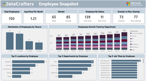
Figure 1: HR Analytics Dashboard giving a complete workforce view on a single screen
What Excel is actually costing:
Excel has limits. Quantifying what those limits actually cost is what gets dashboard projects funded.
Here is what happens in HR teams still running on spreadsheets. One person spends six to eight hours every month building the leadership headcount report. That is most of a working day, every month, to produce
something that is out of date the morning it lands. A VP asks on Tuesday how attrition in Ops compares to Sales this quarter. The answer arrives Thursday. By Thursday, the VP has moved on to the next fire.
The file that worked fine at 500 employees starts lagging at 5,000 and crashes at 50,000. The analysis gets simpler instead of deeper, which is exactly the wrong direction. Three people open the same file, three people make different edits, and suddenly no one knows which version is correct. Someone schedules a meeting just to decide.
Excel is not useless. It is the wrong layer to run a 1,000-person workforce on. SHRM benchmarks put the average cost per hire at around $4,700 and the average time to fill a role at 42 days. If your workforce data lags by a month, you are already a month into the replacement cycle before you even know you needed to retain someone.
Excel vs Power BI, side by side:
Here is the comparison in plain terms.
| The task | In Excel | In Power BI |
| Monthly headcount report | Someone burns a weekend stitching export together | Auto refreshes overnight, ready before your Monday coffee |
| 50,000 employee records | File hiccups, crashes, or quietly corrupts | Handles it without breaking a sweat |
| A new question from a VP | Rebuild pivot tables, hope you get it right | Click a couple of slicers, answer in seconds |
| Keeping everyone on the same numbers | Three versions of the truth, one confused meeting | One source, same numbers for everyone |
| Catching an attrition spike | You see it in next month’s report, if you are lucky | You see it the day it starts |
| Sharing with execs | Email an attachment, pray they open the right tab | Send a link, they see live data on their phone |
| Adding a new metric | Rebuild the template, retrain everyone | Drop in one visual, everyone gets it instantly |
Why Traditional HR Reporting Fails
The problem with Excel is that it was not designed for modern HR decision-making. Here is where it breaks:
- Delayed insights: Reports are created monthly, not continuously
- Fragmented data: Hiring, performance, and attrition data live in separate files
- No predictive capability: You see trends only after they happen
- Manual dependency: One person becomes the bottleneck for all reporting
According to Gartner, organizations that fail to modernize their analytics capabilities struggle to make timely, data-driven decisions, especially in fast-changing workforce environments.
What HR Professionals Actually Need
Most HR teams are not asking for definitions of “turnover rate.” They are asking:
- Which employees are most likely to leave in the next 3 months?
- Which departments are at risk of burnout?
- Are our hiring efforts improving retention?
These are decision-level questions. Excel is not built to answer them effectively.
What this actually unlocks (two real scenes)
Two real scenarios show the difference:
Scene one:
Before: HRBP sees the March report. Mumbai Ops lost five people in January and February. By then, a sixth is interviewing elsewhere. Exit interviews get written. Nobody reads them.
After: HRBP opens the dashboard Tuesday morning. The tenure band in Mumbai Ops dropped by three. She messages the manager before lunch. Interviews happen Friday. Two flight risks stay. Gallup keeps repeating the same finding: roughly 52 percent of voluntary leavers say their manager could have saved them. This is how you turn that 52 percent into something real.
Scene two:
Before: Finance asks HR to justify recruiting spend. HR sends a spreadsheet. Finance pushes back. HR pulls a different cut. Finance pushes back again. Everyone loses an afternoon arguing about whose numbers are right.
After: Open the dashboard, filter by department and month. Finance sees the same numbers. The conversation shifts from “is this data right” to “should we pull two requisitions from Sales and push them into Ops.” That is the whole point. The debate stops being about data integrity and starts being about business.
There are other scenes. Catching diversity drift in February instead of in the annual report. Noticing that one job title has quietly become a single point of failure. Seeing your five plus year tenure band hollow out before half of it retires next year. But the two above are the ones that matter most.
Reading the KPI cards like an analyst
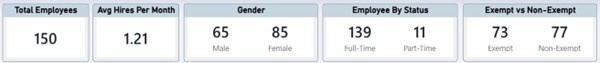
Figure 2: KPI cards showing headcount, hiring rate, gender mix, employment status, and exempt classification briefly
Each KPI card tells a story:
Total Employees, 150. The anchor. Every other ratio on the dashboard keys off this. If it drifts from the plan finance has on file, something in hiring or attrition is moving, and you probably want to know which one.
Avg Hires Per Month, 1.21. A recruiting capacity check. If the plan needs three hires a month and you are doing barely one, you are not going to make it up next quarter by wishing. This is the number that should be pushing the conversation about sourcing channels, agency spending, or loosening the req.
Gender, 65 and 85. Healthy at the total level. It almost always hides something at the leadership level. The first thing to do with this card is filter by grade and department.
Full Time vs Part Time, 139 and 11. Tells you how predictable payroll is and how much flex sits in the cost base. A quiet drift toward part time is usually somebody cutting without saying so out loud.
Exempt vs non-exempt, 73 and 77. More of a compliance card than an analytics card. Misclassification is the kind of mistake that ends up in a lawsuit. Keeping this visible every day means no surprises.
Tenure: the chart that matters most
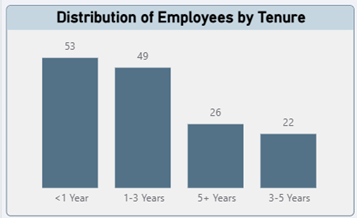
Figure 3: Distribution of employees by tenure band, showing workforce experience and stability
If you could only keep one chart on this dashboard, keep this one.
It tells the full story in one glance. 53 people under a year means onboarding load on managers is heavy right now. 49 in the one-to-three-year band is historically where most voluntary exits come from. That is your flight risk pool. 22 in the three-to-five-year band is thin. 26 people with five plus years is your institutional memory and your succession bench, and both of those things are more fragile than they look.
The question this chart raises is always about balance. If the under one year band keeps growing and the three-to-five-year band is shrinking, your onboarding is bleeding people before they become productive. If the five plus band is hollowing out with nothing behind it, you are one retirement announcement away from a real knowledge crisis.
Growth by department, or the chart that ends arguments
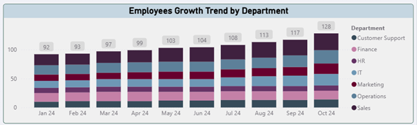
Figure 4: Monthly headcount growth by department from January to October 2024
Headcount went from 92 in January to 128 in October. That is 39 percent growth in 10 months, which is a lot of new faces.
What matters here is the shape. Every department grew roughly in step. Sales and Operations led, with IT, Marketing, and Finance following at a reasonable pace. Nothing looks wildly out of line with the business plan.
If one department was growing twice as fast as the plan called for, the conversation you need to have is with the budget owner, not the recruiter. If another department was flat the plan said it should grow, same conversation, other direction. This is the chart that ends arguments which used to take place at three meetings.
Top 5, or where the real risk lives
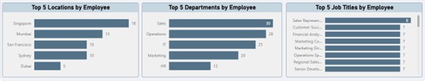
Figure 5: Top 5 breakdown by location, department, and job title showing workforce concentration This is the chart you pull up for nervous executives.
Singapore 18, Mumbai 13, San Francisco 10, Sydney 10, Dubai 5. A globally distributed team with an Asia Pacific lean. That has real implications for time zones, HR partner coverage, and which local labor laws you need to stay tight on.
Sales and Operations together are 58 of the 150 people, almost 40 percent. If hiring slows in either of them, that is where you feel it first. And the job title spread is flat, with no single role above eight people. That is the good news here. It means no single resignation can take down a function. If this chart showed 25 Sales Reps and everything else in single digits, you would flag it as a concentration risk in your next review.
The real value, in one sentence
A good HR dashboard changes what you are allowed to argue about.
When finance, HR, and the business are all looking at the same refreshed numbers, the debates stop being about whose spreadsheet is right. They start being about what to do. Deloitte’s 2024 Global Human Capital Trends research, which surveyed 14,000 leaders across 95 countries, found that organizations making real progress on human capital priorities are nearly twice as likely to hit the outcomes they want. The dashboard makes that work possible.
If you are still waiting a month to find out what your workforce did last month, the question is how fast you can get v1 in front of your HR team and let them start making better decisions.
Conclusion
Real-time workforce analytics shift HR from reactive reporting to proactive retention. The organizations that built this capability early are the ones capturing the 52% of preventable turnover Gallup identified. They see it before it shows up in next quarter’s attrition report.
HR leaders can move from month-old spreadsheets to daily decision-making with accurate data, real-time monitoring, and clear visualizations. This approach helps organizations:
- Identify flight risk employees before turnover costs compound
- Align workforce capacity with business goals
- Demonstrate HR’s strategic value with data-backed insights
- Make informed decisions about hiring, development, and retention
If your leadership team is still reviewing month-old workforce data, the question is not whether to modernize. It is how much preventable turnover you are willing to lose while you wait.
Sources
- Gallup research on voluntary turnover costs and preventable departures, including the one trillion dollars estimate and the 52 percent manager intervention finding.
- SHRM Human Capital Benchmarking data on average cost per hire and time to fill.
- Deloitte 2024 Global Human Capital Trends, survey of 14,000 leaders across 95 countries.
- Work Institute Retention Reports on preventability of voluntary turnover.