How do two measures relate to each other, and does a third measure change the size of that relationship? The scatter chart plots two measures against each other, one region, company, or product per point, so patterns, outliers, and clusters surface on their own. Power BI ships this behind a single native visual, the Scatter Chart, which is flexible enough to be reshaped into a bubble chart or a dot chart depending on how it is configured. The Intelligence Sheet takes the same idea and splits it into a dedicated family: Scatter, Bubble, and Quadrant, each built for a different reading of the same two-measure comparison.
Both read from Power BI semantic models. The difference is context: whether the chart compares two measures on a fixed model, or against thresholds that move with the live plan.
Watch It in Action
Power BI: Scatter Chart
Power BI offers exactly one native visual for this family: the Scatter Chart. It plots one measure on the X-axis and one on the Y-axis, with a category or legend field determining how many points appear and how they are colored. That single visual, reconfigured, produces three distinct reading experiences.
Scatter Chart
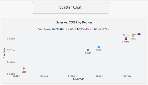
With just X and Y measures assigned, the visual is a straight two-measure comparison: one point per category, positioned by its value on each axis. Below, Total Sales is plotted against Total COGS by sales region: a region sitting up and to the left is generating more sales for less cost, and a region down and to the right is the opposite.
Bubble Chart
Add a third measure to the Size field, and the same visual becomes a bubble chart. Point position still comes from the X and Y measures, but the bubble size now encodes a third value, volume, headcount, or units, without adding a second chart. Below, company Volume GL vs. COGS is plotted with bubble size representing volume, so companies that are both cost efficient and high volume stand out immediately.
Dot Chart
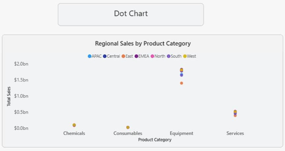
Drop the Y-axis to a categorical field instead of a continuous measure, and the scatter becomes a dot chart: one dot per category, positioned along a single measure. Below, Regional Sales by Product Category shows each region’s sales as a dot within its category, useful for comparing spread within a category rather than a true X/Y relationship.
A note on native scatter charts
One visual covering three reading experiences is efficient, but it means Power BI has no dedicated quadrant or threshold-based chart in this family. Splitting a scatter into “good” and “bad” regions, above target vs. below target, high-margin vs. low-margin, requires manually adding constant reference lines from the Analytics pane and reading the split visually, rather than having the chart classify and shade the quadrants itself. For a quick two- or three-measure comparison, the native Scatter Chart is the right tool. For a chart that needs to state a threshold-based conclusion on its own, it runs out of room.
The point-density behavior is worth understanding before you trust a dense scatter. By default, the visual plots 3,500 points, raised as far as 10,000 in Advanced options, and load time climbs with the count. Below that ceiling the standard algorithm does not plot your data so much as sample it: it keeps the first and last rows and divides the rest evenly, so a 35,000-row series is drawn from every tenth row. The High-density sampling toggle replaces that with an algorithm that represents every point, merging overlapping ones into a single larger circle, which means apparent clustering no longer implies count, since one circle may stand for many points. It also switches itself off silently: bind a Play Axis, add a ratio line, set a Values field to show items with no data, or leave either an axis empty, or the chart reverts to plain sampling while the toggle still reads On. And it only applies to imported models, DirectQuery, or live connections to service-based models at all.
Scatter Charts in the Intelligence Sheet
The Intelligence Sheet reads from the same Power BI semantic models your existing reports use and builds this scatter/bubble family on top of them. Rather than one visual reshaped by field assignment, it offers three purpose-built variants: Scatter Chart, Quadrant Chart, and Bubble Chart, each reading the same underlying model fields but presenting a different analytical framing.
Scatter Chart
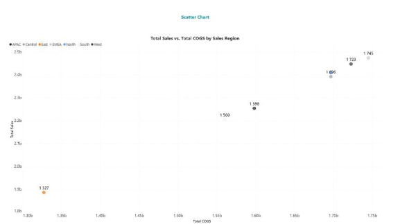
The Scatter Chart variant plots two measures against each other, one point per category, with value labels shown directly on the point rather than requiring a tooltip hover. Below, Total Sales vs. Total COGS by Sales Region mirrors the Power BI native scatter, but every point of sales value is labelled on the canvas.
Quadrant Chart
The Quadrant Chart variant is the reading Power BI’s native visual cannot produce on its own: the canvas is split into four labelled quadrants around a calculated center point, and every category is classified by which quadrant it falls into. Below, Regional Sales and Profitability is split into Quadrant 1 through 4, so regions with high sales and high gross profit sit together in the top right, and the one region below both thresholds is immediately visible in the bottom left, without a manual reference-line setup.
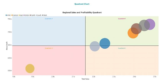
For a scorecard review, that classification is the point. The reviewer does not need to read axis values and mentally sort them; the chart has already sorted them into “which regions are working” and “which are not.”
Bubble Chart
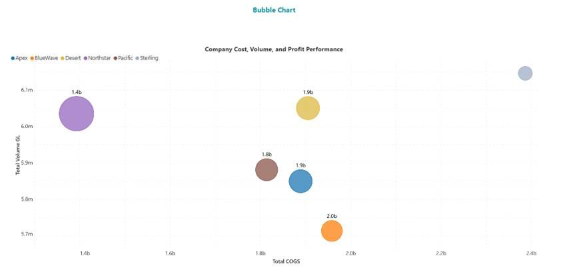
The Bubble Chart variant carries a third measure as point size, same as the native reshaping, but keeps the Intelligence Sheet’s direct value labelling. Below, Company Cost, Volume, and Profit Performance sizes each company’s bubble by total volume GL, with the COGS value labelled above each point, so cost, volume, and scale read together without a legend lookup.
| Variant | Reads | Best for |
| Scatter | Two measures, one point per category | Direct measure-to-measure comparison |
| Quadrant | Two measures, split into four classified regions | Scorecard-style “who is above/below target” review |
| Bubble | Two measures plus a third as size | Cost, volume, and scale in one surface |
These sit alongside the broader three-source architecture behind the Intelligence Sheet, semantic models, Planning Worksheets, and Data Apps, so the same chart that reads a governed model today can be re-pointed at a live plan without a rebuild.
Planning Workflow: Live Thresholds
Because these scatter, quadrant, and bubble visuals sit on your Power BI semantic model, they work on the data you already reported today. Regional sales vs. COGS, company volume vs. cost, product spread across categories: all that comes straight from the model your existing reports already use. Where they go further is when that model is paired with a plan.
Consider a quarterly business review where leadership wants to see which regions are profitable enough, and efficient enough, to fund expansion next year. A quadrant chart built on actuals alone shows where regions stand today, but the boundaries are fixed lines drawn at the start of the period. Connect the same quadrant split to a Planning Worksheet, and the quadrant boundaries become the plan’s own thresholds, this quarter’s target sales, this quarter’s target margin. When the finance team revises the margin target midway through the quarter, every region reclassifies against the new line automatically. That means leadership is judging regions against the plan the business is currently running, not the plan that was true when the chart was first built. A quadrant tied to the plan stays current; one built against a fixed model only shows what was true at the start of the period.
When to Reach for Which
| If your report needs… | Reach for… |
| A quick two-measure comparison across categories from the semantic model | Power BI Scatter Chart |
| A third measure encoded as bubble size for a standard operational dashboard | Power BI Scatter Chart (bubble mode) |
| Spread of a single measure across categories (dot-style reading) | Power BI Scatter Chart (dot mode) |
| Automatic quadrant classification against calculated or plan-based thresholds | Intelligence Sheet Quadrant Chart |
| Value-labelled scatter or bubble points for management decks | Intelligence Sheet Scatter/Bubble |
| Quadrant boundaries or bubble-size measures tied to a live plan or forecast | Intelligence Sheet Quadrant/Bubble |
For a fast, ad hoc look at how two or three measures relate, Power BI’s native Scatter Chart, in any of its three configurations, is the right starting point: it reads the semantic model directly and needs no additional setup.
For scorecard-style or planning-connected reviews, the Intelligence Sheet family is the better fit. It builds the same semantic model but adds automatic quadrant classification and, when it matters most, thresholds that move with the plan rather than sitting fixed for the period.
Getting Started: Scatter Charts in Fabric Intelligence
In the Intelligence Sheet, add a Scatter/Bubble visual and connect it to your Power BI semantic model, the same model your Power BI reports already use. Assign your X and Y measures, then switch chart type between Scatter, Quadrant, and Bubble without rebuilding the field configuration; add a size measure to move from Scatter to Bubble or enable quadrant mode to split the canvas into four classified regions.
The visual supports chart-type switching, automatic quadrant classification around a calculated or plan-based center point, and direct value labelling on every point or bubble, so management decks don’t require tooltip hovers. When you connect to Planning Worksheets, the quadrant boundaries and bubble-size measures can be read from your plan and updated as the plan changes, so the classification is always current.
What’s Next
Episode 12 narrows from two measures to one: the gauge, where a single measure is read against its target on an arc, and the Intelligence Sheet’s linear and angular variants take on the native gauge shifting scale.
Resources
- Plan in Microsoft Fabric IQ — Microsoft Learn: official documentation and getting started guides
- Visualize simulations, budgets, and forecasts — Microsoft Learn: how the Intelligence Sheet updates in real time when planning sheet values change
- Lumel Intelligence: the Lumel product page and three-pillar architecture overview
- Foundation — Part 1: Introducing the Intelligence Sheet: where Plan sits within Fabric IQ
- Foundation — Part 2: Inside the Intelligence Sheet Canvas: the visual library, data architecture, and series index