How does a single measure step down through an ordered sequence of stages, and where is the sharpest fall? That is the funnel question not what a total is made of, but how much of it survives each step to the bottom.
A funnel works best when the stages are a genuine sequence a pipeline, a conversion flow, a revenue to profit bridge each stage a subset of the one above, and a bar is the better reach when the categories are unordered, or you are ranking rather than reducing. Power BI ships one funnel. The Intelligence Sheet ships three a funnel (also a pyramid, inverted or pinched), an executive funnel, and a horizontal executive funnel with the step-to-step change printed on the chart, and a live plan connection native does not offer.
Both read from the same Power BI semantic models; the difference is what each build on tops a plain taper, or the same taper carried on a live plan. The running example is a revenue to profit bridge: Actual sales followed down the P&L from list price, through discount, cost, and operating costs, to the operating profit that survives at the bottom the kind of gross to net to profit walk finance often draws as a waterfall, here read as a single taper.
Watch It in Action
Power BI Funnel
The native Funnel is one of Power BI’s core visuals, purpose built for a linear process with sequentially connected stages where each stage is a portion of the one before it is a sales pipeline, a recruitment or checkout flow, or a P&L bridge like this one. It takes a single Category (the stages) and a single Values measure, with optional color saturation and tooltip fields, and lays the stages out as horizontal bars sorted largest to smallest, so the shape tapers from top to bottom. The top stage anchors at 100% and the visual brackets at the bottom stage as its share of the top here List Sales at 100% narrowing to EBIT at 26.4%.
The funnel job is to expose where a quantity falls fastest. Hover any bar and Power BI reports two conversion figures, percent of first (the share of the top stage) and percent of previous (the share carried from the stage immediately above) the standard reading for spotting a bottleneck. Data labels can print the value, the percent of first, or the percent of previous on the bars; color saturation can shade each bar by a second measure; and the visual cross filters, drills, and themes like any other native chart. In this bridge, the steepest fall is Net Sales to Gross Profit, where the cost of goods removes almost half of what remains exactly the kind of drop the funnel is built to make obvious.
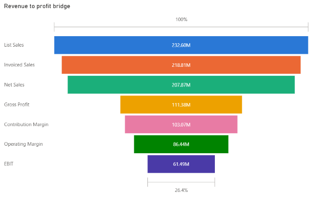
The native Power BI funnels the bridge from 100% at List Sales to 26.4% at EBIT.
Where the native funnel shines
The native funnel is built for one job and does it cleanly: a single measure read down a set of ordered stages, sorted largest to smallest, with the conversion rates a hover away. It is a first party, governed visual themes with the rest of your report, and cross filters and drills like any other native chart, with no marketplace install or assembly to deploy. When the task is a straightforward sequential read on a governed model, that simplicity is the whole point.

Funnel in the Intelligence Sheet
The Intelligence Sheet reads the funnel from the same Power BI semantic models your existing reports use and builds three funnel layouts on top of them from one configuration the same Category and Actual assignment across all of them with a chart type switch determining which one you get. Where the native funnel keeps the stage-to-stage change in a tooltip, two of these three print it directly on the chart.
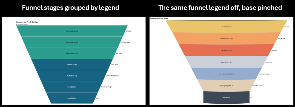
Funnel is a classic silhouette. The seven stages stack inside a tapering funnel, each band labelled with its value and colored by a two part legend the three revenue stages (List, Invoiced, Net Sales) in one hue, the four profit stages (Gross Profit through EBIT) in another so the eye watches the revenue block give way to the profit block as the shape narrows from $232.6M at the mouth to $61.5M at the tip. Stage names sit down on the right edge. This is the presentation’s first variant: the silhouette itself carries the “flows down and narrows” message, which makes it the natural pick for an executive summary or a slide, where recognizability matters more than precise decoding. The two-part coloring is a choice, not a fixture keeps the legend to group the stages into Revenue and Profit blocks or remove it and let each stage take its own color, as in the pinched view below.
Executive Funnel trades the silhouette for a vertical column layout with a full IBCS style of treatment (IBCS for the International Business Communication Standards for financial reporting). Each column is labelled with its share of the top stage (100.0%, 94.1%, 89.4%, 47.9%, 44.3%, 37.2%, 26.4%) and its absolute value below, and the reason to reach for it a color coded badge sits at each step marking the percentage lost from one stage to the next (−5.9%, −5.0%, −46.4%, −7.5%, −16.1%, −28.9%), with directional arrows tracing the flow along the axis. The number the native funnel keeps on hover is here printed on the chart, so the biggest leaks the −46.4% at Net Sales to Gross Profit, where cost of goods lands reads in a single pass. Color is set per stage inside the visual, and the badge palette (positive green, negative red, with an Invert option for cost style funnels where a fall is expected) is a formatting toggle, not a measure.
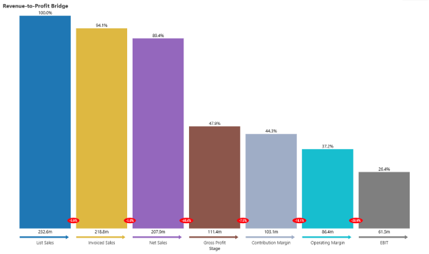
Executive Funnel percent of top on each column, with the step change badge at every step; the −46.4% at Net Sales → Gross Profit is the cost of goods hit.
Horizontal Executive Funnel carries the same executive treatment rotated onto its side: each stage becomes a row, bars extend to the right with the value and percentage beside them, and the step change badges sit on a connecting path running down the left axis. Reach for this orientation when the stage names are long as a P&L’s are, so they read cleanly down the axis instead of truncating, or when a top to bottom reading order matches the way, the bridge is read.
Horizontal Executive Funnel for the same treatment as rows, so long stage names read without truncating.
Three layouts, one foundation. All three variants sit on the same setup a single Category and a single Actual measure, per stage color and number formatting set inside the visual, a legend and drill down, and the same live connection to your semantic model so moving between them is a chart type toggle, not a rebuild. Where they differ is emphasis. The Funnel owns the shape: it switches between funnel and pyramid, flips inverted, pinches to a flat base or runs at a fixed width and offers a legend that groups the stages into blocks (Revenue and Profit here). The two Executive layouts own the analytics on the axis: the step-to-step variance badge, the percent of top labels, the directional arrows, and an integrated data table view, in vertical columns or horizontal rows. Every one of these moves is made on the canvas, and every percentage stays tied to the live plan.

Built for the Planning Workflow
Because these funnels sit on your Power BI semantic model, they work on the data you already report on today. Where they go further is when that model is paired with a plan. A bridge like this one is only partly fixed data: the on-invoice discount and cost of goods come straight from the transactions, but the rebate, freight, marketing, and overhead rates that carve out the lower stages are assumptions exactly the kind of number a plan owns.
In most reporting tools those rates are loaded into the model at the start of the period and sit frozen there while actuals move against them accurately about where the bridge stood in January, silent about every revision since. Read them from a live plan instead and a rate changed this morning re bases every connected funnel by the afternoon: when finance revises the planned overhead rate mid quarter, every stage below it moves and the −28.9% badge on the final step moves with it, in the same place the drop appears. The review reads the new EBIT and closes on a decision, rather than exporting the stages to recompute the deltas by hand.
Assumptions are what a bridge is made of. Keep them in the plan rather than frozen in the model and the taper redraws itself the moment finance changes its mind so the figure at the tip is the one the business is planning to keep.

When to Reach for Which
This is a choice between the native funnel and the Intelligence Sheet funnel family, not between the three Intelligence Sheet layouts, which the section above already sorts out.
| If your report needs… | Reach for… |
| A single measure read down ordered stages, sorted largest to smallest, on a governed report | Power BI native Funnel |
| Conversion rates (percent of first / of previous) on hover, themed and interactive | Power BI native Funnel |
| A funnel that ships in every report with no install, for a quick sequential read | Power BI native Funnel |
| The step-to-step change and percent of top printed on the chart | Intelligence Sheet funnel family |
| A choice of silhouette, pyramid, vertical column, or horizontal row from one configuration | Intelligence Sheet funnel family |
| Stage percentages that re base when the plan’s assumptions are revised | Intelligence Sheet funnel family |
Power BI’s native funnel is the lower friction starting point when the job is a straightforward sequential read on a governed model like a pipeline, a conversion flow, or a bridge, themed and interactive, with the conversion rates a hover away. It is a clean, dependable visual that ships in every report by default.
The Intelligence Sheet funnel family is the fit when the change between stages is the story and you want it printed on the chart, when the shape should flex to a silhouette, pyramid, vertical column, or horizontal row to suit the audience, or when the assumptions behind every percentage should stay tied to a live plan. These are first class chart types reached from one configuration.

Getting Started Funnel in Fabric Intelligence
In the Intelligence Sheet, add a Funnel visual, connect it to the same Power BI semantic model your reports already use, and assign your Category and Actual fields. From there the whole family is one chart type toggle away silhouette, pyramid, vertical executive column, horizontal executive row, so the first thing worth doing is cycling through all four on your own data to see which one puts your story first.
After that, two settings do most of the work: the stage-to-stage variance badge, with its Invert option for cost style funnels where a fall is the expected direction, and the Trellis Row and Column wells, which panel any layout by region or segment without rebuilding it.

What’s Next
Episode 11 turns from flow to relationship: the scatter and bubble family, where Power BI’s native scatter meets the Intelligence Sheet’s quadrant, jitter, and dot plot variants for reading two measures at once.

Resources
- Plan in Microsoft Fabric IQ: Microsoft Learn: official documentation and getting started guides
- Lumel Intelligence: the Lumel product page and three pillar architecture overviews
- Foundation: Part 1 Introducing the Intelligence Sheet: where Plan sits within Fabric IQ
- Foundation: Part 2 Inside the Intelligence Sheet Canvas: the visual library, data architecture, and series index
- Episode 09 Treemap: the previous episode in the series