
Episode 01 introduced KPI cards — the first visual most executives look at in any report. Episode 02 covered variance and IBCS bars — the chart that gets the most attention in a management review. This is Episode 03: the chart for when one number is not the whole story: the combo charts.
Most business reviews do not ask a single question — they ask two at once: how are we tracking on volume, and how does that compare to plan? A combo chart answers that double question in one pass — bars carry the magnitude, a line carries the comparison, and the eye reads both together. Power BI ships a genuine combo visual that handles the everyday version of this well. The Intelligence Sheet treats the combo not as one visual but as a family of named chart types — line-over-column, multi-axis, Pareto, and more — switchable from a single configuration.
Both read from Power BI semantic models. The running example is the same channel revenue review used throughout the series — Store, Online, Reseller, and Catalog — measuring Actual Sales against PY Sales, Target, and Budget: the everyday “are we winning, and against what” report where a combo chart usually does the work.
Power BI — Combo Charts
Power BI ships a real combo visual, and for the common case it is perfectly competent. The limits show up only when the question needs more than two measures or more than two scales.
Line and clustered column — the everyday combo
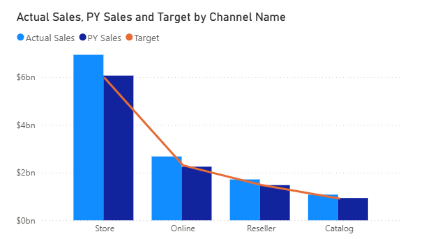
The native Line and clustered column chart (and its sibling, Line and stacked column chart) puts Actual Sales on columns and overlays PY Sales and Target as lines on a secondary axis. Drop the channel on the axis, the measures into the column and line wells, and you have a working actual-versus-target view in a couple of clicks. It cross-filters, drills, and themes like any other native visual, with no marketplace dependency.
Small multiples — paneling the combo
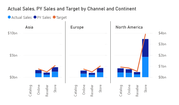
Native combo also panels. Using small multiples, the same column-plus-line chart splits cleanly by continent — Asia, Europe, North America — each panel sharing a legend. That covers a real reporting need without leaving the native canvas.
Pareto via sort and cumulative line
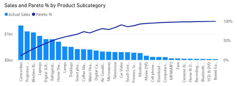
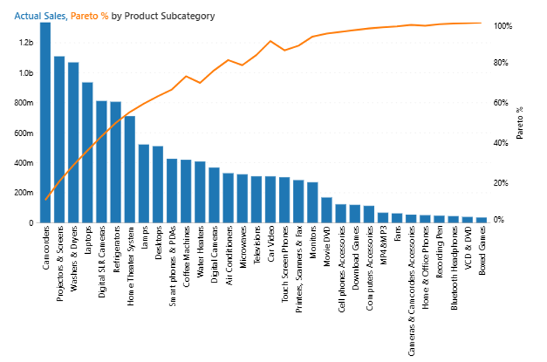
For contribution analysis, Power BI can assemble a Pareto by sorting Actual Sales descending and overlaying a cumulative-percentage line on a secondary axis. The result is readable and shows the familiar 80/20 curve across product subcategories.
A note on native combo
Native combo is built around one shape: columns on a primary axis, a line on a secondary one. Within that shape it is fast and dependable, fitting the common two-measure comparison directly. Putting Actual, PY, and Budget each on its own independently scaled axis sits outside the two-axis model, as do other idioms — column-plus-area, column-plus-column, stacked-column-plus-line — beyond its built-in line-plus-column set. It renders clean by default, leaving data labels, per-panel subtotals, and long-category-name fitting (longer Pareto subcategory names show abbreviated) as author choices rather than automatic ones.
Combo Charts in the Intelligence Sheet
The Intelligence Sheet builds the combo family from one foundation — the same Category and Measure configuration across every variant — with the chart type switch determining which combination you get.
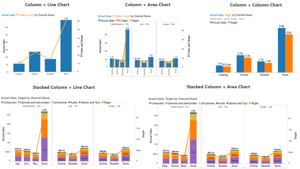
The Column + Line chart is the direct equivalent of the native combo, but ships with data labels on every column and line point and a clean dual axis out of the box. Column + Area swaps the comparison line for a shaded area and panels by continent with the per-panel total printed in the header — a subtotal the native small multiple does not give you. Column + Column drops the line entirely to set Actual against Target as two labeled bars per channel, useful when both measures deserve equal visual weight rather than one being relegated to a line.
The stacked variants extend the idea into composition-plus-trend. Stacked Column + Line and Stacked Column + Area break each channel into product categories (Computers, Cameras and camcorders, Cell phones, Audio, Games and Toys) and overlay Target on top — every segment labeled with its own value. That is a composition story and a target story in one visual, which native combo cannot assemble.
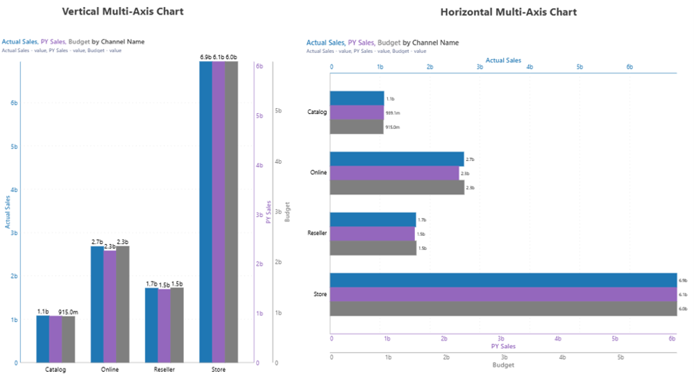
Where the Intelligence Sheet opens a genuine gap is the multi-axis combo. The Vertical Multi-Axis chart plots Actual Sales, PY Sales, and Budget as three side-by-side bars per channel, each anchored to its own color-matched axis (blue, purple, grey), so three measures on different scales read cleanly without one swamping the others. The Horizontal Multi-Axis chart does the same rotated, with stacked axes across the top and bottom — an orientation that has no native equivalent at all. This is the three-independent-axes case native tops out before reaching.
Finally, the Pareto chart renders the same cumulative-contribution curve as native, but auto-fits the full subcategory names on the axis (Camcorders, Projectors & Screens, Washers & Dryers…) instead of truncating them, and keeps both the bars and the percentage line legible end to end.
The underlying configuration is the same across all variants. What changes is the chart type switch — giving the full combo family from a single visual surface, with no rebuild required between them.
Built for the Planning Workflow
A combo chart in a management pack rarely compares Actual to a settled number. The line it plots — Target, Budget, or forecast — is a planning measure, still being managed as the period progresses and finance revises it.
Because the Intelligence Sheet connects directly to Planning Worksheets inside Fabric Plan, the comparison line reflects the latest forecast, not the one locked at period start. A target revised in the Planning Sheet moves the line across every connected report immediately, and annotations can be attached at the channel or time-period level — context on a specific gap, in the same place it appears.
The Planning Difference
A combo chart in most reporting tools answers a historical question: how did actuals track against a target that was set in the past? The target lives in the data model; it does not change unless someone manually updates it and waits for the next refresh.
In a planning workflow, the question is different. The forecast is still being managed, and the gap between actuals and the current plan is a moving measure, not a settled one. A management pack built on a static semantic model snapshot cannot reflect that — by the time it is published, the line it draws may already be out of date.
Because the Intelligence Sheet reads the comparison line from Fabric Plan, the combo reflects the current state of the forecast — not the one locked when the report was last refreshed. A budget revision entered this morning surfaces in the line this afternoon. The person reviewing the chart sees the same numbers the person managing the plan is working with.
That alignment — between the plan being managed and the chart measuring against it — is what turns a combo chart from a reporting artefact into a planning instrument.
When to Reach for Which
| If your report needs… | Reach for… |
| A straightforward two-measure column-plus-line combo, themed and interactive | Power BI line + clustered/stacked column |
| Pareto or small multiples built in a few clicks at no marginal cost | Power BI native combo |
| An interaction-heavy or very large report where native optimization matters | Power BI native combo |
| Three or more measures on independent, color-matched axes | Intelligence Sheet multi-axis |
| A horizontal multi-axis layout | Intelligence Sheet Horizontal Multi-Axis |
| A combo type native does not ship — column + area, column + column, stacked + line/area | Intelligence Sheet combo variants |
| Data labels, per-panel subtotals, or full-length Pareto axis names | Intelligence Sheet combo variants |
| A comparison line that updates automatically when the plan is revised in Fabric Plan | Intelligence Sheet combo variants |
For a straightforward two-measure column-plus-line — themed, interactive, and free — Power BI’s native combo is the lower-friction choice. It is also the better fit where the report is interaction-heavy or large, or where a governed environment rules out additional Fabric capacity.
For three or more measures on independent axes, a horizontal layout, a combo type native does not ship, or any chart where labels, subtotals, and a clean Pareto matter to the audience — the Intelligence Sheet is the fit. These are first-class chart types it was built around rather than workarounds, and the comparison line stays tied to the live plan.
Getting Started — Combo Charts in Fabric Intelligence
Open a Plan item in any Fabric workspace and add a Column + Line visual from the Intelligence Sheet visual library. Assign your Category and Measure fields. Switching between Column + Line, Column + Area, Column + Column, the stacked variants, multi-axis, and Pareto is a chart type toggle — no rebuild needed between variants.
Once your visual is placed, these are the key capabilities to explore for combo reporting:
Combo Types — Column + Line, Column + Area, Column + Column, and the stacked variants are all reachable from the same configuration. Pick the combination that fits the story rather than rebuilding from a fixed line-plus-column template.
Multi-Axis — Plot three or more measures on their own color-matched axes, vertical or horizontal, so measures on different scales read cleanly without one swamping the others. This is the case native tops out before reaching.
Labels & Subtotals — Data labels apply to columns, lines, and stacked segments by default, with per-panel subtotals printed in the header. Presentation polish is first-class rather than fiddly secondary-axis work.
Pareto — The Pareto chart type auto-fits full category names on the axis instead of truncating them, keeping bars and the cumulative line legible end to end.
Analytics Layer — Reference lines, trend lines, error bars, and Pareto curves can be added on top of any combo variant without switching visuals — turning a channel comparison into a contribution analysis in the same surface.
If your organization is not yet on Fabric, Microsoft offers a 60-day trial to evaluate Plan on real data before committing.
What’s Next
Episode 04 covers the bar chart family — where Power BI’s clustered, stacked, and 100% stacked bars meet the Intelligence Sheet’s sorted, grouped, and small-multiple variants, and how the choice of bar layout changes which comparison the reader sees first.
Resources
- Plan in Microsoft Fabric IQ — Microsoft Learn — official documentation and getting started guides
- Lumel Intelligence — the Lumel product page and three-pillar architecture overview
- Foundation — Part 1: Introducing the Intelligence Sheet — where Plan sits within Fabric IQ
- Foundation — Part 2: Inside the Intelligence Sheet Canvas — the visual library, data architecture, and series index
- Episode 01 — KPI Cards — the previous episode in the series
- Episode 02 — Variance and IBCS Bars — the previous episode in the series