
Episode 04 covered the bar chart family: the horizontal workhorse for ranking. This is Episode 05: the same comparisons stood vertical, the column chart family.
A column is a bar rotated vertical, but the rotation is not cosmetic: it changes what the chart is good at. Bars run horizontal, so they absorb long category names and long rank lists without strain. Columns run vertical, so they read most naturally left to right along an ordered axis (time, size bands, stages) and they start to crowd once the categories pile up or the labels run long. The comparison each layout makes is identical to its bar sibling: clustered puts the side by side gap first, stacked puts the total first, 100% stacked puts the mix first. Power BI ships all three columns natively. The Intelligence Sheet ships the same three, then keeps going into dumbbell, range, overlapping, and lollipop columns that reframe the comparison again.
Both read from Power BI semantic models. The difference is context: which comparison the column puts first, and whether the benchmark it measures against is still live. The running example continues from Episode 04: a brand and channel revenue review across Contoso, Fabrikam, Litware, and Adventure Works, sold through Store, Online, Reseller, and Catalog, measuring Actual Sales against Target and PY Sales.
Power BI Column Charts
The native column family is as dependable as its bar counterpart. Three layouts cover the three classic comparisons, and all of them share the same plumbing: a category on the axis, one or more measures from your Power BI semantic model in Values, and the full native formatting surface (data labels, legend control, axis and gridline settings, tooltips, drilldown, and an Analytics pane for reference lines). All of them cross filter, drill, theme, and panel into small multiples like any other native visual.
Stacked column chart
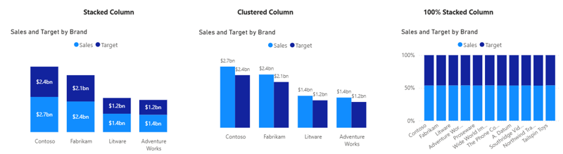
The Stacked column chart adds the measures end to end inside a single column per brand, so the column height carries the total and the segments carry the breakdown. Drop the category on the axis and two or more measures (or one measure split by a legend field) into Values, and each column resolves into its parts. You can switch on data labels for every segment plus a total label above each column, set the legend order, and apply conditional formatting to color a segment by a rule, flagging, say, any channel that falls below a threshold. It is the right reach when the total is the headline and the split is supporting detail. Its limit is precision: only the bottom segment shares a common baseline, so segments stacked higher up are hard to compare exactly from one column to the next.
Clustered column chart
The Clustered column chart places Actual Sales and Target side by side for each brand: the most direct way to read a gap. Each measure keeps its own column, data labels can be switched on for both, and the eye compares heights within each category pair. From the Analytics pane you can lay a constant or average reference line across the plot; sorting by Actual reorders the brands into a ranking; and conditional formatting can turn the Actual column red wherever it falls short of Target. It is the default reach for actual versus target comparison, and it stays readable up to three or four measures per category before the cluster begins to crowd.
100% stacked column chart
The 100% stacked column chart normalizes every column to full height and shows each segment as a share. Magnitude disappears by design; what remains is the mix: how the proportion between the measures shifts from brand to brand. Data labels render as percentages, the legend names the segments, and the shared 0100% axis makes it ideal for spotting a channel that is over or underweighted in one brand relative to the rest. One thing worth knowing: native 100% stacked columns show only percentage labels. You cannot display both the percentage and the absolute value in the same label; the usual workaround is a tooltip page or a separate matrix below the visual.
A note on native columns
Native columns deliver the same dependability as their bar counterparts same plumbing, same formatting surface, no marketplace needed. The edges are the same as the bar family’s, plus one the vertical orientation makes sharper: columns crowd as categories grow. In the 100% stacked panel above, eleven brands force the axis labels to rotate and abbreviate (“Wide World Im…”, “Northwind Tra…”): the exact case where the horizontal bar from Episode 04 is the better rotation. Layouts beyond the three (dumbbells, range plots, overlapping Actual on Prior Year columns, lollipops) are not in the family, and a variance mark between two columns needs DAX measures or a separate visual rather than a setting. Zoom sliders are available and let viewers filter the visible data range dynamically; enabling one on the X axis requires switching the axis type from Categorical to Continuous, which trades named category labels for a numeric range. Small multiples panel titles do not support display unit or decimal place formatting, which means headers default to raw numbers; set those at the model level to keep them readable
Column Charts in the Intelligence Sheet
The Intelligence Sheet reads from the same Power BI semantic models your existing reports use, and builds the column family on top of them from one foundation: the same Category and Measure configuration across every variant, with the chart type switch determining the layout. Two things carry across all of them: presentation defaults are turned up (segment values, totals, and full category names print by default), and an analytics layer (reference lines, trend lines, Pareto) plus IBCS formatting (solid actuals, outlined budget, hatched forecast, green/red variance) sit on top of whichever layout you pick.
The three core layouts mirror native, with those defaults already on.
Stacked Column
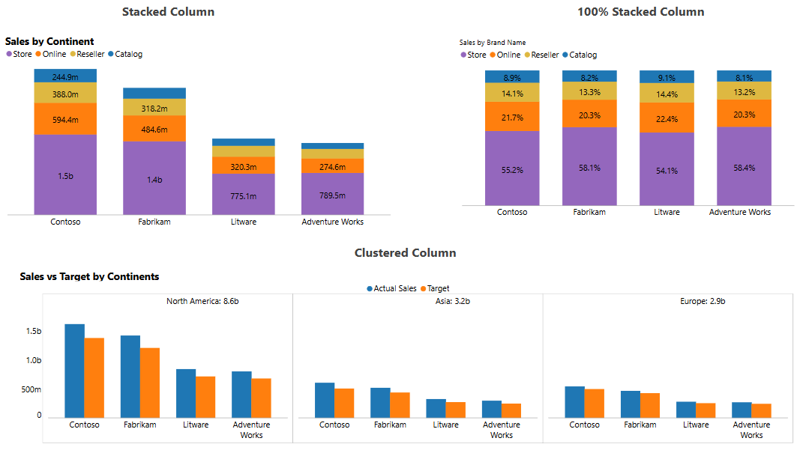
Stacks the channel segments inside each brand’s column, so the height carries the total and the bands carry the breakdown. Every segment prints its own value and the column total sits in the header by default: you show the parts and the total at once, without the tradeoff native forces. Segment order and color are configurable, conditional rules can flag a band that breaches a threshold, and IBCS fills keep actuals, budget, and forecast visually distinct. Reach for it when the audience needs the exact segment figure, not an estimate read off the band’s height.
100% Stacked Column
Normalizes every column to full height and shows each channel as a share of its brand, with the percentage printed on every band and full brand names kept on the axis: no rotation, no truncation. It answers the mix question: which channel dominates a brand, and how that weighting shifts across the set. Because the axis is fixed at 0100%, a small brand and a large one line up for a direct read of composition regardless of size. The tradeoff is the one normalizing always carries: magnitude drops out, so pair it with a stacked or clustered column when absolute size also matters.
Clustered Column
Sets Actual and Target side by side per brand and panels the whole chart into small multiples by continent, printing the per panel total in each header (North America: 8.6b, Asia: 3.2b, Europe: 2.9b): a subtotal the native small multiple does not give you. Every panel holds the same Actual versus Target pairing on a shared scale, so a regional breakdown and its totals read together and stay directly comparable. Data labels, sorting, and reference lines apply per panel, and the layout extends to any dimension (region, segment, cost centre) not just geography. It is the reach for an actual versus target comparison that also has to break out by group.
Beyond the core three, the family keeps going into layouts native does not ship.
Dumbbell Column
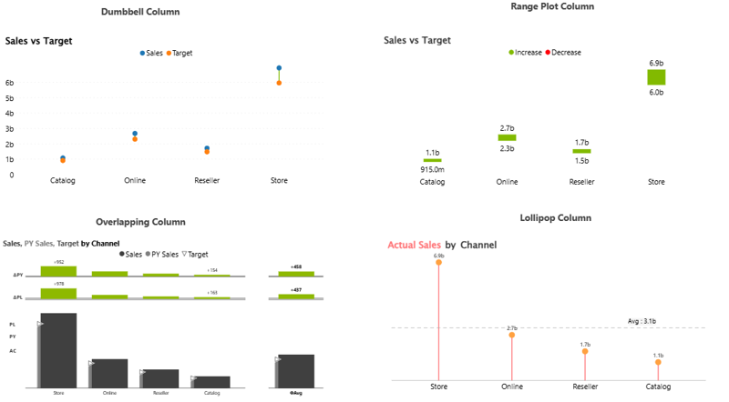
Drops the bars entirely and marks Actual Sales and Target as two dots joined by a stem, so the length of the connector is the gap and its direction shows at a glance. Stripping the fill out lets a single page carry many channels without the visual weight clustered columns bring: ideal for a dense scorecard where every row is an actual versus target pair. A reference line can mark a shared target band, and conditional coloring can tint the connector by whether the channel cleared its mark. Best when the comparison is strictly two points per category and space is tight.
Range Plot Column
Fills the gap between two values as a single block: green where the value rises, red where it falls, so direction and magnitude read in one mark. A tall red block is a large shortfall; a short green one a narrow beat, which makes the chart scan faster than two separate bars. It fits budget to actual, open to close, or start to end movements where the size of the change is the story. This is distinct from a waterfall, which shows intermediate steps: the Range Plot shows only the net movement from start point to end point. Thresholds can adjust what counts as favorable, and the same analytics layer applies on top.
Overlapping Column
Lays Actual Sales, PY, and Target into one column (actuals as the full column, prior year and target as thinner overlaid marks) so three measures read in a single upright shape instead of three clustered ones. It is the most compact way to carry a full actual / prior-year / target comparison per category, with conditional rules flagging the misses and IBCS notation making the over/under instantly legible. Switch the deviation marks on and the same column doubles as a variance view. (Integrated variance column in IBCS terms; full variance treatment: absolute and relative variance, pin charts, and deviation arrows, in Episode 02; the same measures on independent axes in Episode 03.)
Lollipop Column
Reduces each channel to a stem and a dot: the ranking of a column chart with most of the ink removed, plus an average reference line (Avg: 3.1b) that reframes the read as above-or-below benchmark rather than absolute height. It works where the page is busy, or where each channel’s position relative to a benchmark is the point rather than its exact size. The reference line can be set to an average, a target, or any measure on the canvas, and the dots can carry their own value labels. Reach for it for a clean ranking with a benchmark, not for precise magnitude comparison.
The underlying configuration is the same across all variants: what changes is the chart type switch, giving the full column family from one visual surface with no rebuild between them.
Built for the Planning Workflow
Because these columns sit on your Power BI semantic model, they report on the data you already have. They go further when that model is paired with a plan: in a quarterly review the Target is rarely settled finance trims one channel and lifts another while the review is happening so the gap each column reports is measured against a number that is still moving. When a target is revised, the overlapping column’s variance and the range plot’s block redraw against the new figure on the spot, and an annotation records why, so the review closes on a decision rather than a reconciliation.
The Planning Difference
Both tools read the columns from the same Power BI semantic model; the difference is where the comparison comes from. In most reporting tools target and prior year are loaded into the semantic model at the start of the period and hold their height while actuals move beneath them, blind to any revision since. Midperiod, plans rarely hold still, and a static semantic model only catches up at the next refresh.
When the comparison is read from a live plan instead, a target revised this morning rebases the gap in every connected report by the afternoon, without an export or reconciliation step: the variance is against the plan as it stands, not as it stood at build time.
A column chart that keeps pace with the plan it measures is a planning instrument, not a reporting artefact.
When to Reach for Which
| If your report needs… | Reach for… |
| A clustered, stacked, or 100% stacked comparison across a few ordered categories, themed and interactive | Power BI column charts |
| Small multiples paneling in a few clicks at no marginal cost | Power BI column charts |
| An interaction heavy or very large report where native optimization matters | Power BI column charts |
| A from to gap drawn as an increase or decrease block per category | Intelligence Sheet Range Plot Column |
| Actual, prior year, and target compared in one upright column | Intelligence Sheet Overlapping Column |
| A low ink ranking with a benchmark line, or a stripped down two point comparison | Intelligence Sheet Lollipop / Dumbbell Column |
| Columns measured against a target that updates when the underlying plan is revised | Intelligence Sheet column variants |
For the three classic layouts across a handful of ordered categories (themed, interactive, and free), Power BI’s native columns are the lower friction choice. And when the categories are many or the labels long, the better move is to rotate to the native bar from Episode 04 rather than reach for a different tool.
For the layouts beyond the three (overlapping variance, range, dumbbell, lollipop) or any report where segment labels, per panel totals, and full category names matter to the audience, the Intelligence Sheet is the fit. These are first class chart types rather than workarounds, and the comparison inside every column stays tied to the live plan.
Getting Started Column Charts in Fabric Intelligence
In the Intelligence Sheet, add a Column visual and connect it to your Power BI semantic model the same model your Power BI reports already use. Assign your Category and Measure fields. Switching between clustered, stacked, 100% stacked, dumbbell, range, overlapping, and lollipop is a chart type toggle: no rebuild needed between variants.
Once your visual is placed, these are the key capabilities to explore for column reporting:
Column Variants. Clustered, stacked, 100% stacked, dumbbell, range, overlapping, and lollipop layouts are all reachable from the same configuration. Pick the layout that puts the right comparison first rather than rebuilding the visual for each.
Small Multiples. Panel any column layout by continent, region, or any dimension, with the perpanel total printed in each header: cross panel comparison and subtotals in one view.
Range Plot. Draw the gap between two values as a directional block: green for an increase, red for a decrease, so size and direction read together.
Overlapping Columns. Lay Actual Sales, PY, and Target into a single column with the variance marked in place, compressing a three measure comparison into one upright shape.
Lollipop & Benchmark Lines. Reduce a measure to a stem and dot per category and add an average or target reference line, turning a ranking into an above or below benchmark read.
What’s Next
Episode 06 moves from comparison to trend: the line chart, where Power BI’s standard, stepped, and forecast enabled lines meet the Intelligence Sheet’s clustered, baseline, and variance variants, and the comparison line stops tracking a frozen benchmark and starts following the live plan.
Resources
- Plan in Microsoft Fabric IQ: Microsoft Learn: official documentation and getting started guides
- Lumel Intelligence: the Lumel product page and three-pillar architecture overview
- Foundation: Part 1 — Introducing the Intelligence Sheet: where Plan sits within Fabric IQ
- Foundation: Part 2 — Inside the Intelligence Sheet Canvas: the visual library, data architecture, and series index