Episode 03 covered combo charts and multi-axis: the chart for when one number is not the whole story. This is Episode 04: the workhorse of business reporting, the bar chart family.
Every bar chart answers the same underlying question: who is ahead, who is behind, and by how much? What changes between the variants is which comparison the reader sees first. A clustered bar puts the side-by-side comparison first: Actual against Target, brand by brand. A stacked bar puts the total first and the composition second. A 100% stacked bar drops the magnitude entirely and puts the mix first. Power BI ships all three natively, and they are among the most dependable visuals in the product. The Intelligence Sheet ships the same three, then keeps going into overlapped bars and dot plots that reframe the comparison again.
Both read from Power BI semantic models. The difference is context: which comparison the bar puts first, and what target sits behind it. The running example throughout is a brand and channel revenue review: Contoso, Fabrikam, Litware, and Adventure Works, sold through Store, Online, Reseller, and Catalog, measuring Actual Sales against Target and PY Sales.
Power BI — Bar Charts
The native bar chart family is one of Power BI’s strongest suits. Three layouts cover the three classic comparisons — each reading its measures straight from your Power BI semantic model — and all of them cross-filter, drill, theme, and panel into small multiples like any other native visual.
Stacked bar chart
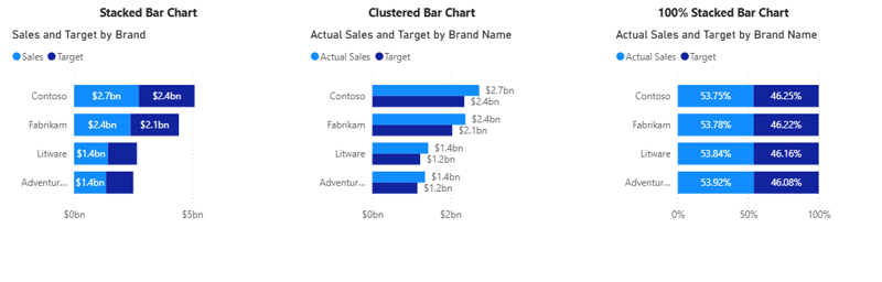
The Stacked bar chart adds the measures end to end inside a single bar per brand, so the total length carries the headline and the segments carry the breakdown. It trades the precise side-by-side comparison for a compact footprint — useful when the total matters more than the gap.
Clustered bar chart
The Clustered bar chart places Actual Sales and Target side by side for each brand — the most direct way to read a gap. Each measure keeps its own bar, data labels can be switched on for both, and the eye compares lengths within each category pair. This is the default reach for actual-versus-target ranking.
100% stacked bar chart
The 100% stacked bar chart normalises every bar to full width and shows each segment as a share. Magnitude disappears by design; what remains is the mix — how the proportion between the measures shifts from brand to brand.
A note on native bars
The three native layouts hold their ground well — no assembly work, no marketplace dependency, and each one ready to deploy on a governed semantic model. The edges show elsewhere. Layouts beyond the three (overlapping Actual-on-Prior-Year bars, dot plots, bars on independent axes) are not in the family, and a variance mark between two bars needs DAX measures or a separate visual rather than a setting. Presentation details are author choices too: labels are off until switched on, and long category names abbreviate, unless the axis is resized by hand. Small multiples for bars show up to 100 values by default; this can be raised to 500 via Format > Small multiples, but the limit is real at scale — useful to know before building a long-tail product or SKU report. Conditional formatting is available on clustered and stacked bars via the Format pane (gradient, threshold rules, or a DAX field-value expression that drives bar color from a measure), a practical way to flag any bar that misses its benchmark without a secondary visual.
Bar Charts in the Intelligence Sheet
The Intelligence Sheet reads from the same Power BI semantic models your existing reports use, and builds the bar family on top of them from one foundation — the same Category and Measure configuration across every variant — with the chart type switch determining which layout you get.
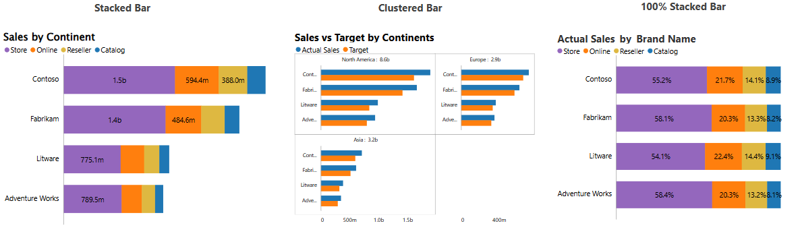
The three core layouts mirror native, with presentation defaults turned up. The Stacked Bar labels every segment with its own value: Store, Online, Reseller, and Catalog readable inside each brand’s bar without hovering. The Clustered Bar panels into small multiples by continent with the per-panel total printed in the header (North America: 8.6b, Europe: 2.9b, Asia: 3.2b): a subtotal the native small multiple does not give you. The 100% Stacked Bar prints the share on every segment and fits the full category names down the axis, so the channel mix reads end to end without truncation.
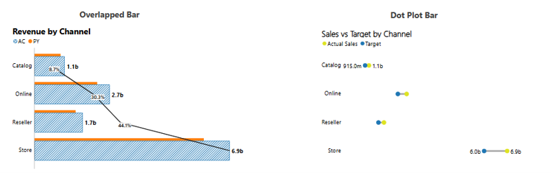
Beyond the core three, the family keeps going into layouts native does not ship. The Overlapped Bar lays Actual over Prior Year in a single row per channel (actuals hatched, prior year behind) with the variance percentage marked at each bar and a path connecting them down the chart, so the gap and its trend read in one pass. (For the full IBCS variance treatment: integrated absolute and relative variance, pin charts, and deviation arrows, see Episode 02.) The Dot Plot Bar strips the bars back to paired dots, putting Actual and Target on a clean shared scale, the lowest-ink version of the same comparison, useful when the page is dense.
The underlying configuration is the same across all variants. What changes is the chart type switch, giving the full bar family from a single visual surface, with no rebuild required between them.
Built for the Planning Workflow
Because these bars sit on your Power BI semantic model, they work on the data you already report on today. Where they go further is when that model is paired with a plan: a sales director reviewing channel performance mid-quarter needs each bar read against the target the channel currently carries, not the one set in January. When a target is reallocated, the bars re-rank against the revised number and an annotation on the affected channel explains why, in the same place the gap appears, so the review can close on a decision rather than a reconciliation.
The Planning Difference
Both tools read the bars from the same Power BI semantic model; the difference is where the target comes from. In most reporting tools it is loaded into the semantic model at the start of the period and sits frozen there while actuals move against it — accurate about the past, silent about any revision since. Mid-period, targets rarely hold still, and a static semantic model only catches up at the next refresh.
When the comparison is read from a live plan instead, a quota moved between channels this morning re-bases every connected bar by the afternoon, with no export and no reconciliation step: the ranking is against the plan as it stands, not as it stood.
A bar chart that keeps pace with the plan it measures is a planning instrument, not a reporting artefact.
When to Reach for Which
| If your report needs… | Reach for… |
| A clustered, stacked, or 100% stacked comparison on a standard report, themed and interactive | Power BI bar charts |
| Small multiples paneling in a few clicks at no marginal cost | Power BI bar charts |
| An interaction-heavy or very large report where native optimization matters | Power BI bar charts |
| Actual over prior year in one overlapped bar, with the variance marked on the chart | Intelligence Sheet Overlapped Bar |
| Segment labels, per-panel totals, and full-length category names by default | Intelligence Sheet bar variants |
| Bars ranked against a target that updates when the underlying plan is revised | Intelligence Sheet bar variants |
For the three classic layouts on a standard analytical report (themed, interactive, and free), Power BI’s native bars are the lower-friction choice, and among the most dependable visuals in the product. This is the episode where native genuinely holds its ground.
For the layouts beyond the three (overlapped comparison, dot plots) or any report where labels, subtotals, and full category names matter to the audience, the Intelligence Sheet is the fit. These are first-class chart types rather than workarounds, and the target behind every bar stays tied to the live plan.
Getting Started — Bar Charts in Fabric Intelligence
In the Intelligence Sheet, add a Bar visual and connect it to your Power BI semantic model — the same model your Power BI reports already use. Assign your Category and Measure fields. Switching between clustered, stacked, 100% stacked, overlapped and dot plot is a chart type toggle — no rebuild needed between variants.
Once your visual is placed, these are the key capabilities to explore for bar reporting:
Bar Variants. Clustered, stacked, 100% stacked, overlapped, and dot plot layouts are all reachable from the same configuration. Pick the layout that puts the right comparison first rather than rebuilding the visual for each.
Small Multiples. Panel any bar layout by continent, region, or any dimension, with the per-panel total printed in each header: cross-panel comparison and subtotals in one view.
Overlapped Bars. Lay Actual over Prior Year in a single row with the variance percentage marked at each bar, turning a two-bar comparison into a one-row read.
Dot Plot. Swap bars for paired Actual and Target dots on a shared scale: the most compact version of the same comparison for dense report pages. Best when you have 20 or more categories and clustered bars become too visually noisy to scan.
If your organization is not yet on Fabric, Microsoft offers a 60-day trial to evaluate Plan on real data before committing.
NOTE: Plan and the Intelligence Sheet are now generally available in Microsoft Fabric. Billing is active — check the Microsoft Learn Documentation for current licensing and capacity requirements before deploying.
What’s Next
Episode 05 rotates the family vertical: the column chart family, where Power BI’s clustered, stacked, and 100% stacked columns meet the Intelligence Sheet’s dumbbell, range, overlapping, and lollipop variants.
Resources
- Plan in Microsoft Fabric IQ: Microsoft Learn: official documentation and getting started guides
- Lumel Intelligence: the Lumel product page and three-pillar architecture overview
- Foundation: Part 1 — Introducing the Intelligence Sheet: where Plan sits within Fabric IQ
- Foundation: Part 2 — Inside the Intelligence Sheet Canvas: the visual library, data architecture, and series index
- Episode 01 — KPI Cards — the previous episode in the series
- Episode 02 — Variance and IBCS Bars — the IBCS variance treatment cross-referenced here
- Episode 03 — Combo Charts and Multi-Axis: the previous episode in the series